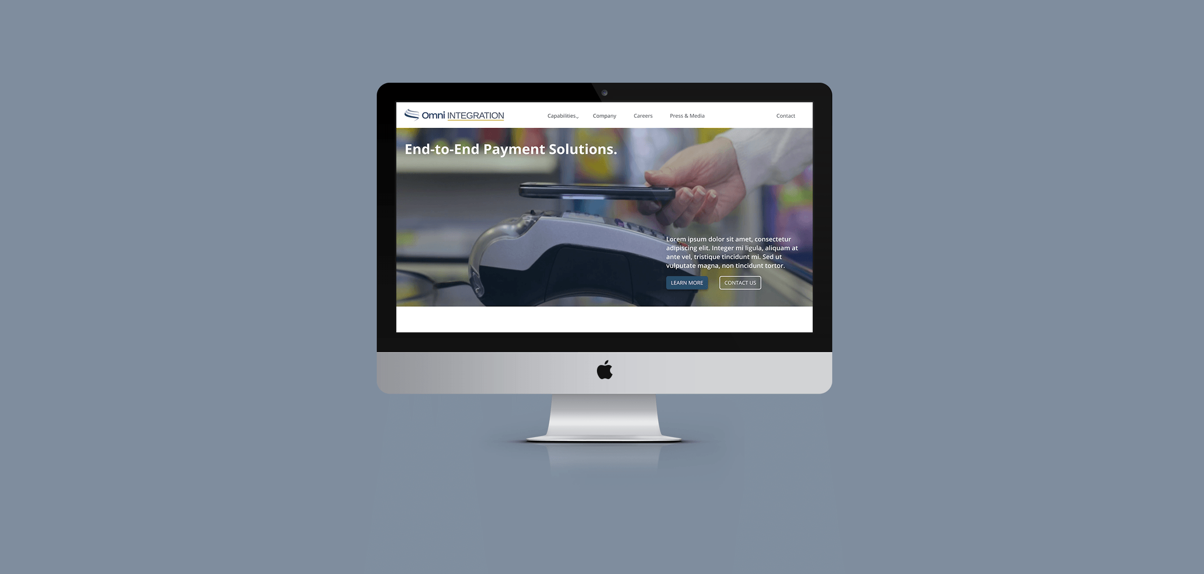
Payment Services Website
Overview
As a contractor for Omni Integration, a payments-focused software development house and services provider, I worked to ensure efficient, secure interface designs for mobile applications, closely in collaboration with the mobile app development team. The website had been much an afterthought when first developed several years prior, so I requested the opportunity to conduct a user-centered redesign. After approval, I sprinted to complete the project with limited work hours and overall time left before the end of my contract.
Project Goal
Effectively communicate the variety of services Omni Integration provides, in a clear, usable website design. Secondly, to keep functionality constrained to facilitate a 1-2 month development process, and within the capabilities of the WordPress platform.
Duration
May 2020
My Roles
Current website usability/design audit
UX design
Page design
Content writing
Production & developer support
Background Research
The website redesign began with examining the existing site for areas that should be kept, removed, or changed. Throughout this process I made special note of seemingly important copy to re-utilize in the revamped pages.
Notes mainly included ways to make the website more consistent, readable, and organized, as well as several ideas for additional content and interactivity that I expected would make the website flow better from an end user perspective.
Several competitors in the payment processing and commerce space were researched, in order to understand how they attempted to effectively organize and present content. This information fed into later relevant user flows and design decisions.
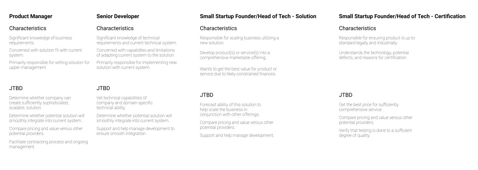
Defining Audiences
From conversations with several coworkers at the company, and in lieu of hard statistics, I gleaned that many of our clients are professionals in other software companies, and many are referred by word-of-mouth or otherwise personal referrals.
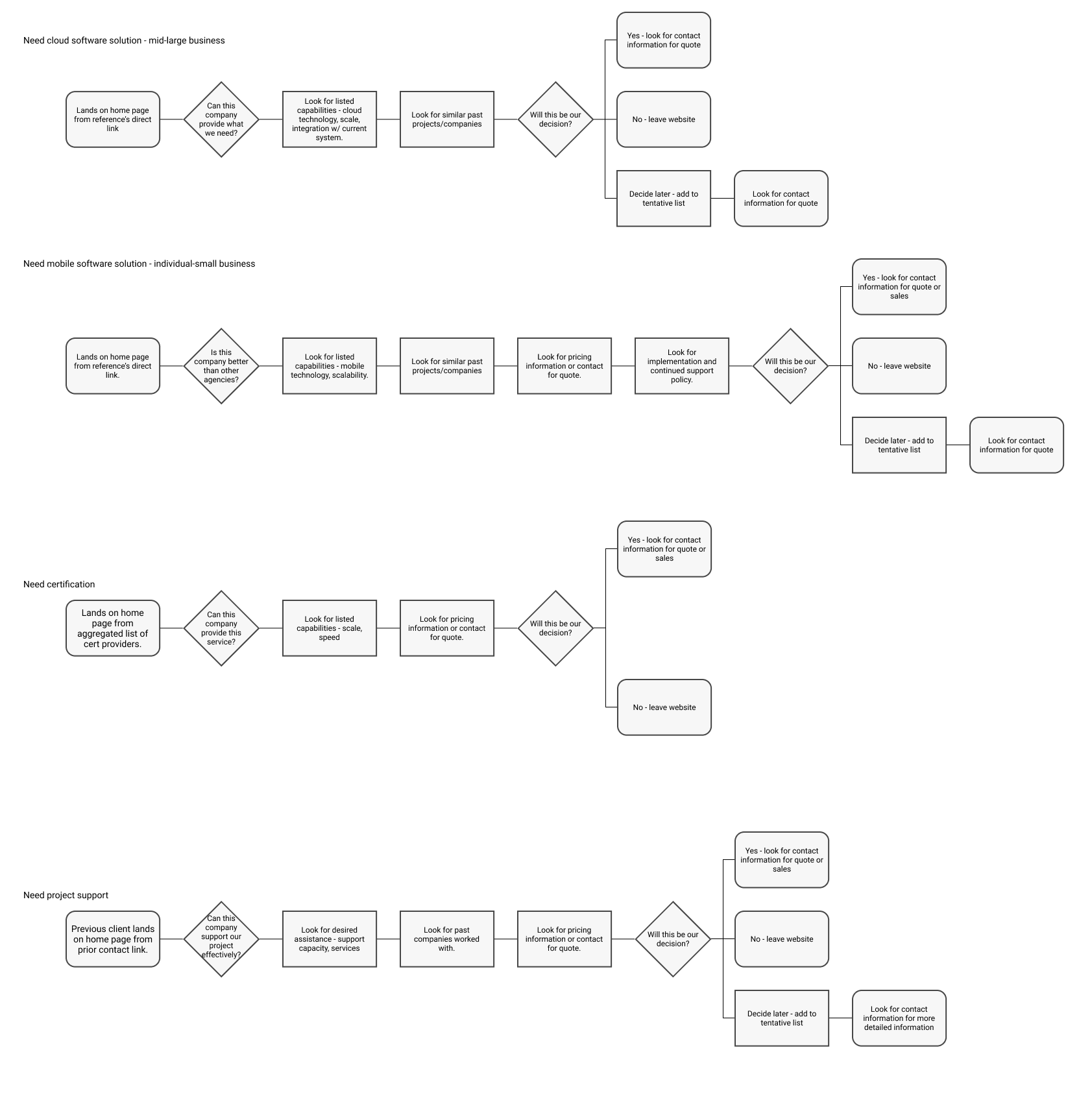
Through some persona- and flow-writing, this information helped me to define how these latently-familiar potential clients may navigate the website, what information they might be looking for, and what stage in their own project planning process they may be going through.
Overall takeaways included:
- Website organization and information architecture, as well as the core way in which we presented our service offerings, had to be renovated.
- Most, if not all, stock photos would have to be removed and replaced by either original office photos, solution hardware/software images, or illustrations.
- Testimonials from previous clients, as opposed to just brand logos, could help describe what sort of projects we can complete in more detail, hopefully aligning with a potential new client’s needs.
- Various UI and layout adjustments needed to be made in order to give the website a sense of consistency and professionalism.
- Mobile layouts, counterintuitively, would actually be especially important, given the use of QR codes at trade shows, in making a positive first impression on prospective clients.
Omni's Offerings
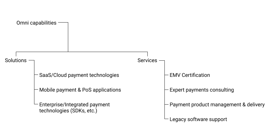
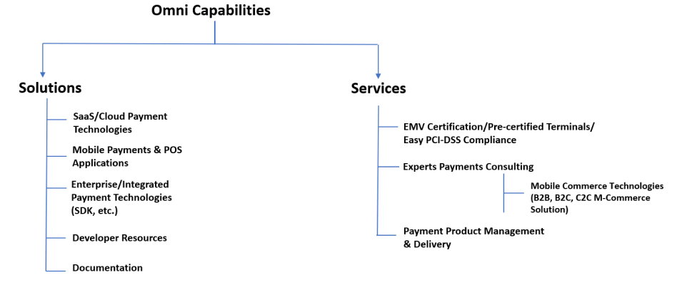
One major point of revision was the conceptual structure in which we presented Omni’s services to potential clients. With previous presentation being somewhat all over the place, I proposed a revised structure involving the separation of software solutions and other services, further divided into distinct, easily comprehensible service areas.
Through several rounds of iteration with my managers and several coworkers, we revised the preliminary structure. I then aggregated the most pertinent information to include under each category for use in the website’s revised copy.
Web Technologies
Several web technologies were considered for implementation of the redesign. I had originally queried our developer which he would be most comfortable with, but due to him defaulting to me, and having gained no initial input from either of my managers, I was tasked with making the decision.
Our original design was a custom development based on the CodeIgniter PHP framework, hosted and registered through iPage. I noticed that iPage had a section labeled “WordPress” on their website, leading me to expect there was sufficient compatibility between the two. WordPress also offered a cheap and user-friendly CMS, perfect for a company that outsources most development work. And, given that the site would be largely static, with only simple interactivity required, I surmised that it would be a great fit for our needs.
Also considered, among others, was Webflow, a combined website building and hosting platform, but it was ultimately abandoned due to the company’s recent migration to iPage, and an existing hosting contract in place.
Initial Design
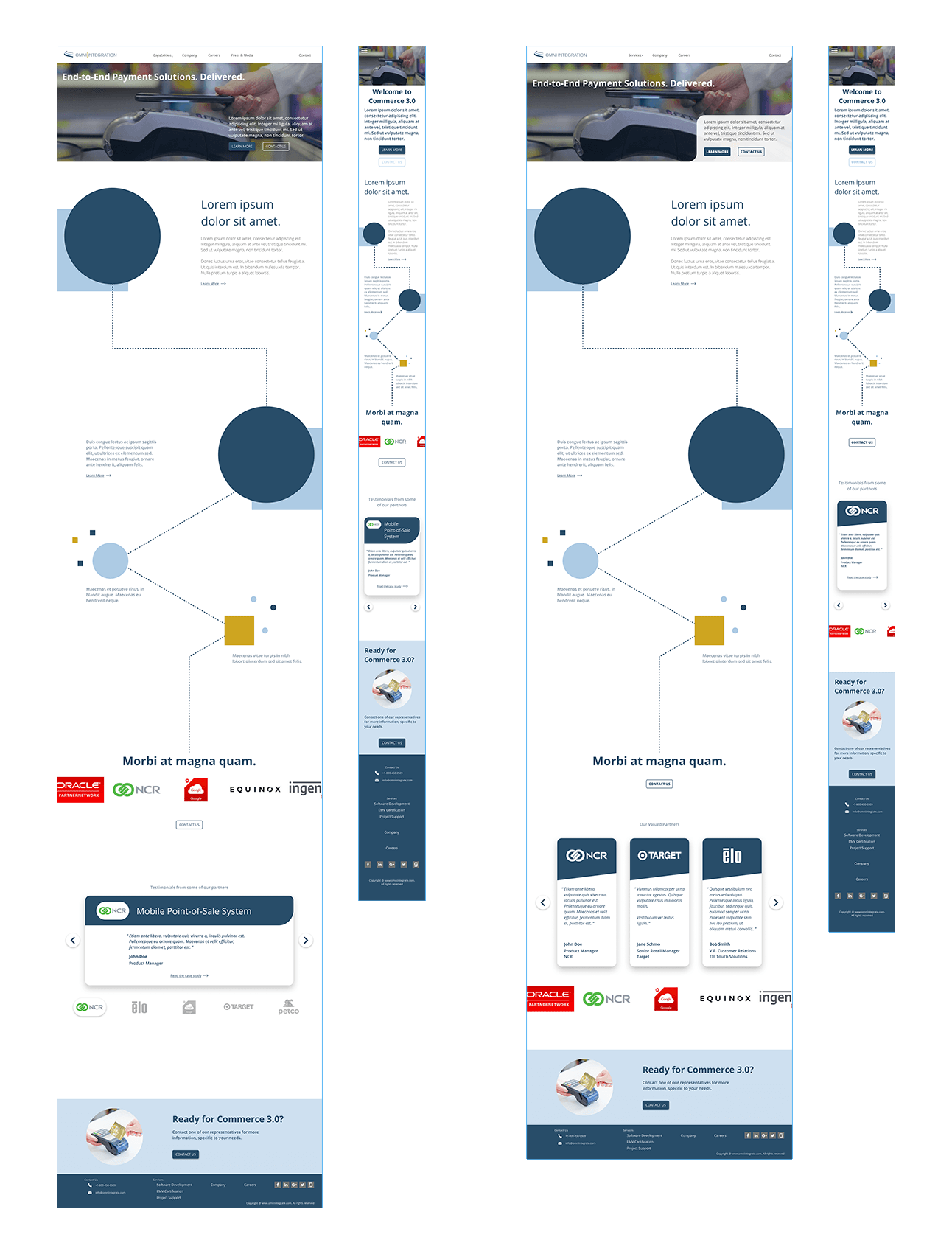
Pressed to get an initial design ready for review, I postponed content creation in favor of getting something out on the table. I put together these 2 responsive alternatives to gain feedback on the general look and feel for the website overall.
Our idea was to create an extended, process-esque graphic to depict our range of service offerings, and how they all tie together in the context of the larger payment processing space. Obviously, this would take time to illustrate or edit together, so for this version simple shapes were included as placeholders.
Iteration & Final Design
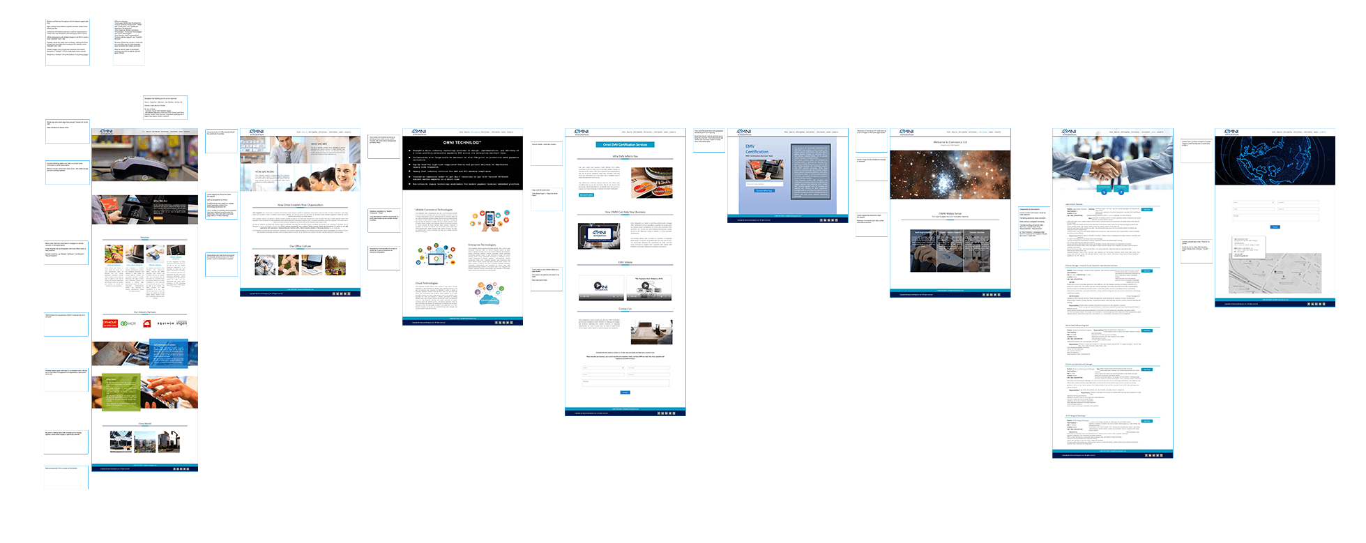
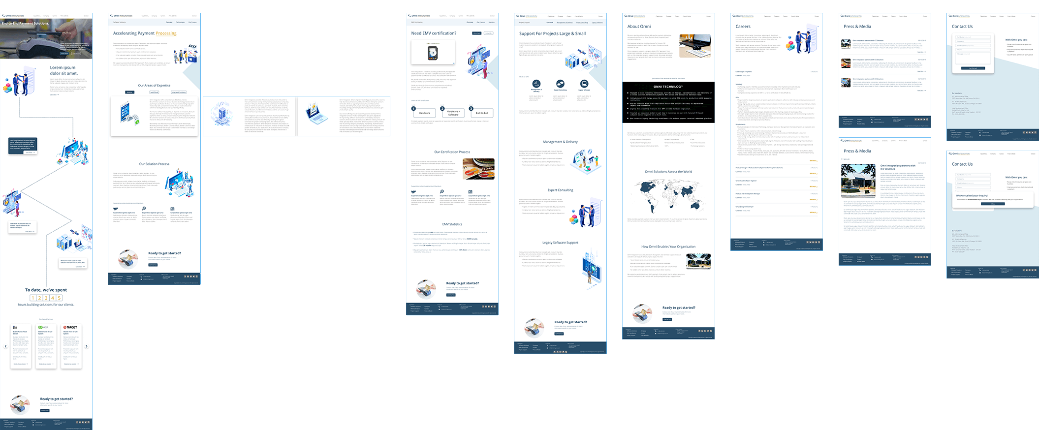
Over about a week, meeting with my manager several times, we iterated the first pages and I designed the rest of the pages in the same style. Unfortunately, I wasn’t allotted enough time to do a complete second draft, or even to entirely finish the first one, but nonetheless was able to finish a design comprehensive enough to be of use to our web developers.
The design was intended to facilitate primarily those users that already have some sort of established relationship with the business, and secondarily new prospective clients for whom this is a first contact point with the company. Ways in which this was achieved included clear separation and interlinking of likely services users are looking for, clearer explanation of the concrete process for each individual service, and a persistent “contact us” CTA as an extended footer on each primary page.
Interactive Prototype
Takeaways
This project included a classic example of a tight deadline, and furthermore a tight amount of time to get it finished within that time period. I had the opportunity to practice a fully essentialized UX process, drawing on information from higher-ups in the company to validate aspects of our client base, and then to figure out how to best create a tailored user interface with limited knowledge of final content.
