Public Health Data Websites
Overview
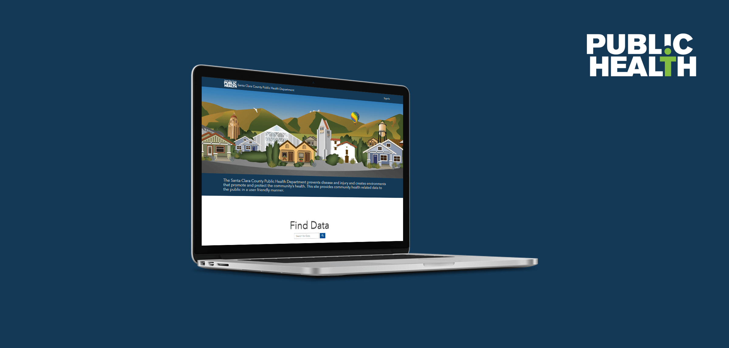
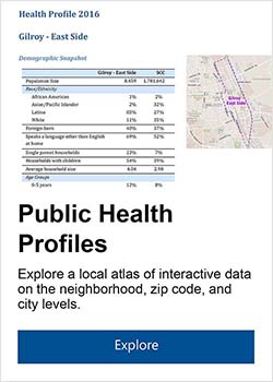
The County of Santa Clara's Public Health Open Data Portal makes public health-related datasets easy to access, reference, and understand. Built through Esri's Open Data platform, it was intended to provide a better way to share the data that is routinely requested by various public service programs and nonprofits, journalists, students, and small businesses. It's also a platform to host simple web applications, called data stories, that provide introductions to different public health target areas.
Project Goal
Provide a comprehensive health data resource for Santa Clara County.
Pain Points We Addressed
Data request turnaround time was too long
Current website made it difficult to find datasets
Data often presented raw, or in a way that was confusing
My Roles
Content strategy and communication design
Web page and information architecture design
UI analysis and instructional design
Audience definition, persona development, and process flow diagramming
Qualitative survey, interview, and comment analysis
Quantitative web metrics collection and analysis
Multimedia production and management
Process
I had the opportunity to bring a user-centered design process into several different parts of this project, from pre-launch content strategy, to launch promotion, to post-launch training and evaluation.
Initial Research
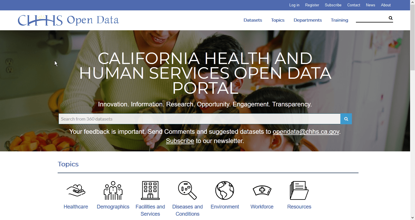
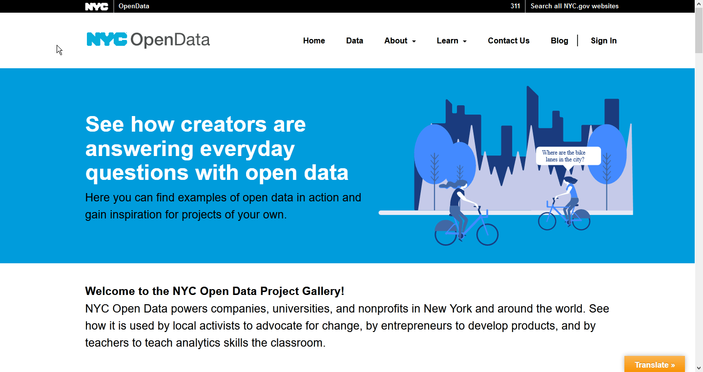
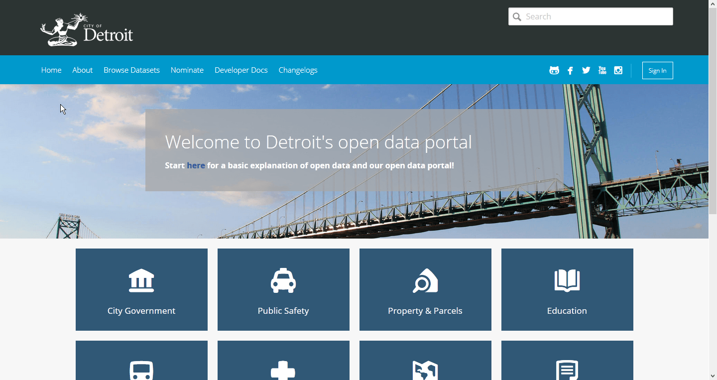
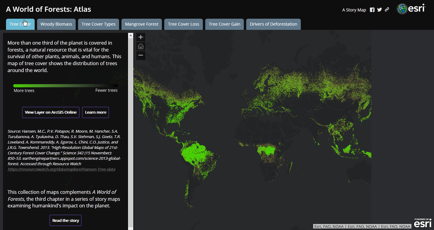
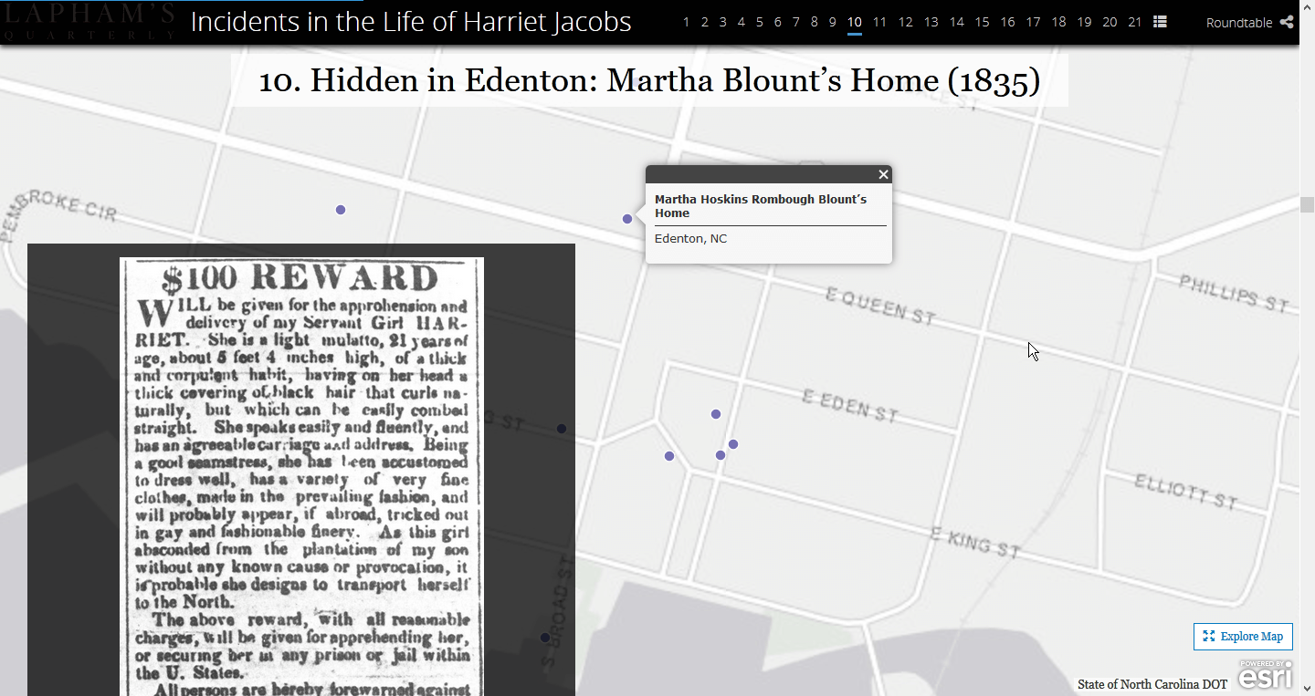
I began with looking at data portals built by other organizations to get a sense of what kind of content they had, data and otherwise, and how they were presenting that information. I specifically noted different ways that spatial data was presented as part of a narrative, which was to be our primary presentation format.
I found a couple of different ways that organizations presented data. Some made heavy use of map layers to provide multilayered views of a subject, while others went with a more media-centric approach. Knowing that we had a range of stories being planned across that spectrum, I kept track of transitions, interactions, and presentation styles to bring up during planning sessions.
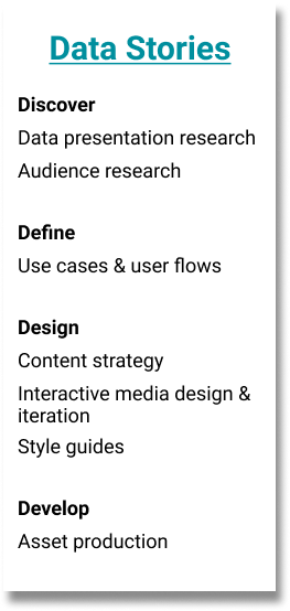
Over the course of the next 5 months, I worked with several different teams to plan, strategize, and design the content, structure, narrative, and intended takeaway of the data stories for each of their programs.
Intended Uses Have Included:
Education tools
Promotions for program work
Interactive data references
Catalysts for change
Jumping-off points
Defining Target Audiences
All intended target audiences when I started working on this project were summed up by “various internal and external stakeholders, and the general public”. After a bit of background research into the programs I was working with, I asked some questions about, and begin to specify more clearly, who each of these data stories was intended for.
Data Story Designs
What good are targets if they're not aimed at?
Through a combination of rough personas, user flows, and/or simple use cases, I advocated for a user-centered approach to varying degrees depending on how involved I had the opportunity to become with each data story. Audience definition work came through in the final designs in several different ways.
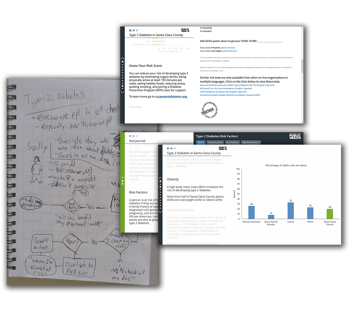
Type 2 Diabetes
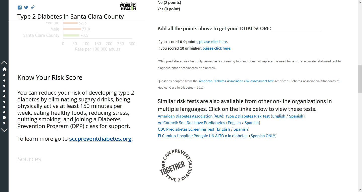
The at-risk group target audience for the Type 2 Diabetes story became an embedded self-test for diabetes risk.
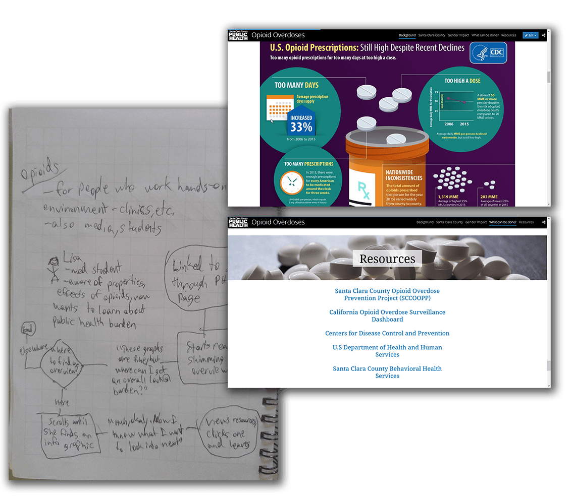
Opioid Overdoses
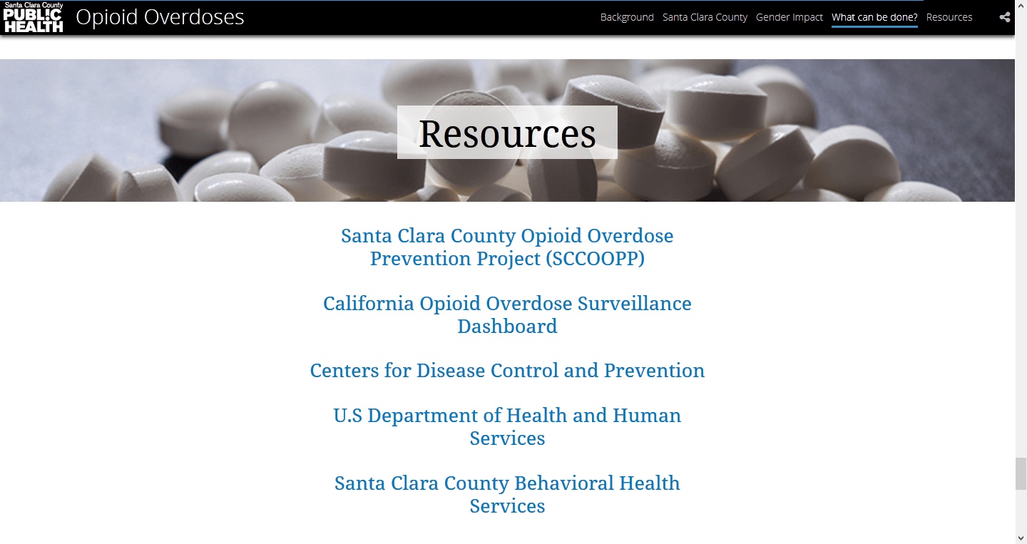
The widespread topic of opioids, as well as the nonprofit/academic target audiences, became a design structured as a jumping-off point for further learning.
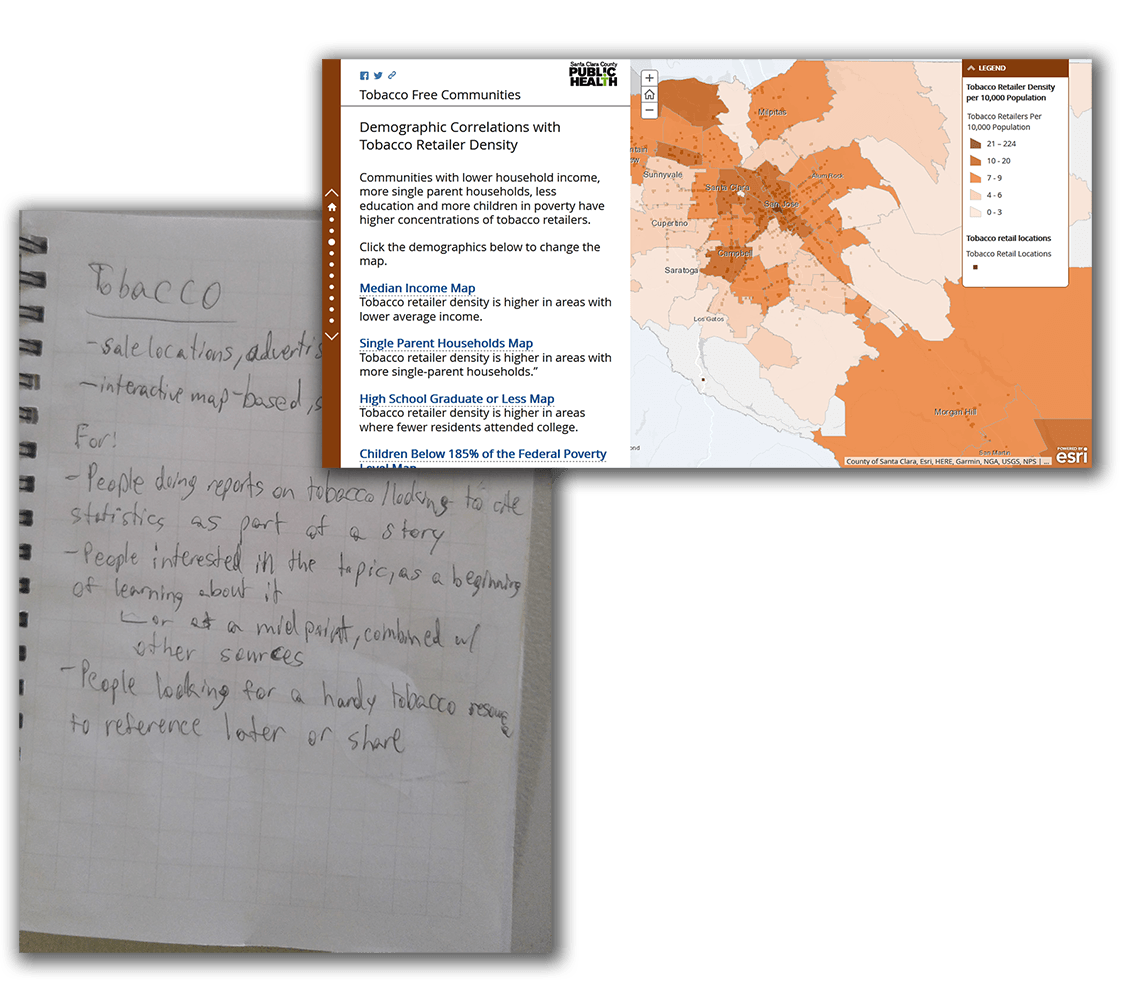
Tobacco-Free Communities
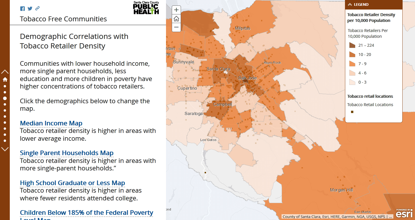
The local emphasis of the tobacco story and its popularity as a target area led to a layout that could double as either an educational tool or a referential one.
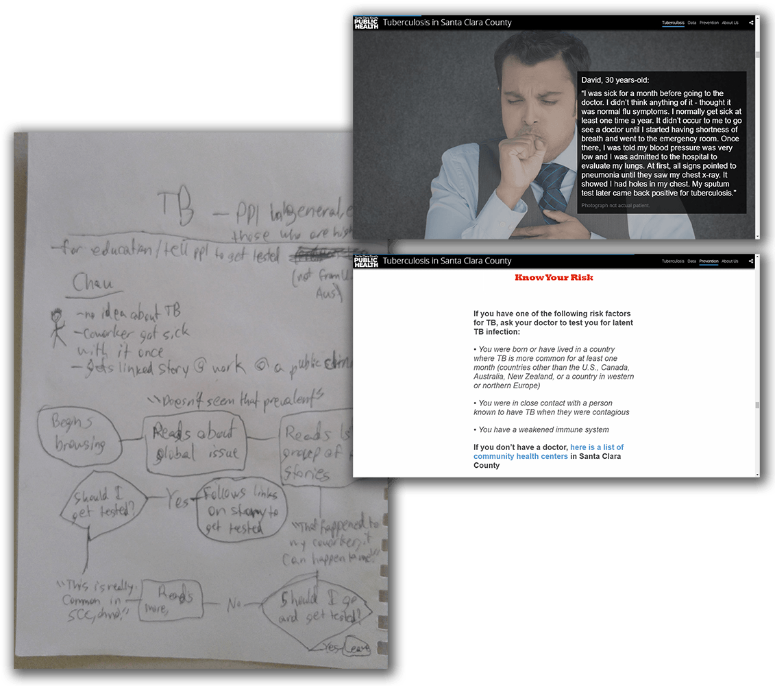
Tuberculosis
The at-risk group target audience of the tuberculosis story lead to a dispersed series of personal stories of tuberculosis patients and an extended call-to-action.
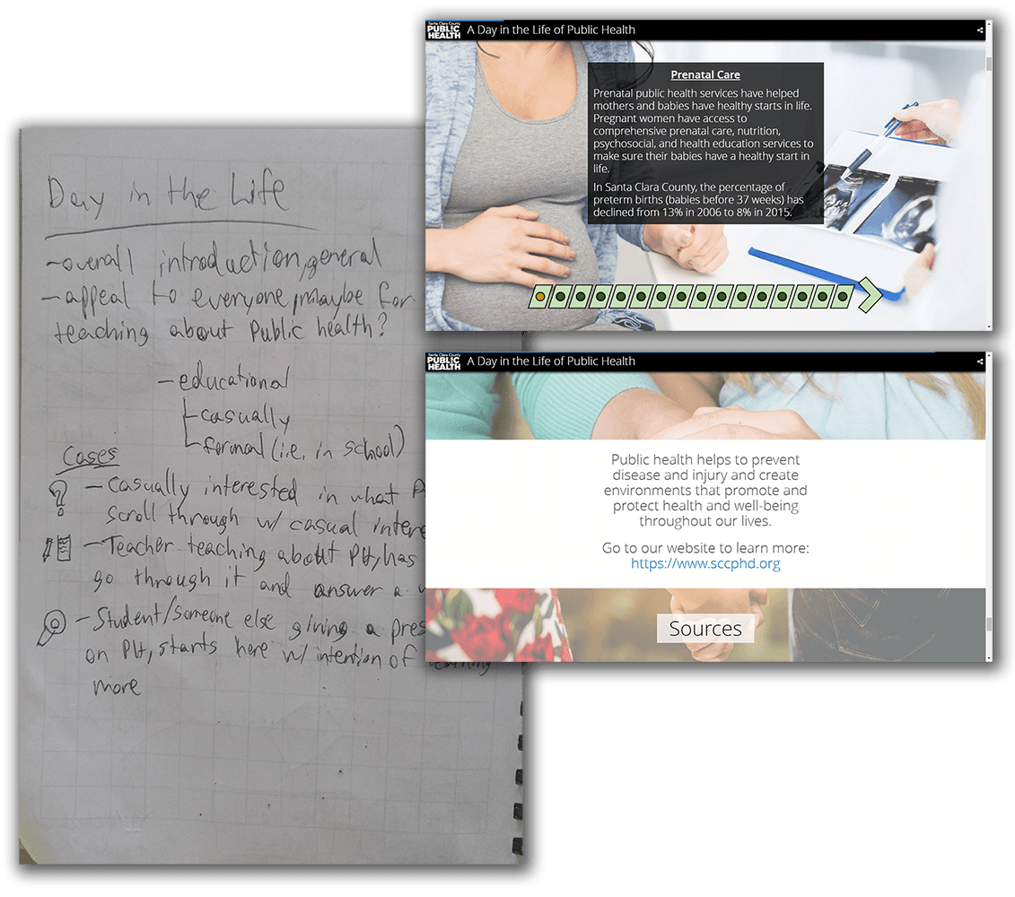
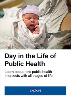
A Day in the Life of Public Health
The casual, introductory nature of the DitL story became a simple, streamlined design, and emphasized segmentation for potential early education use.
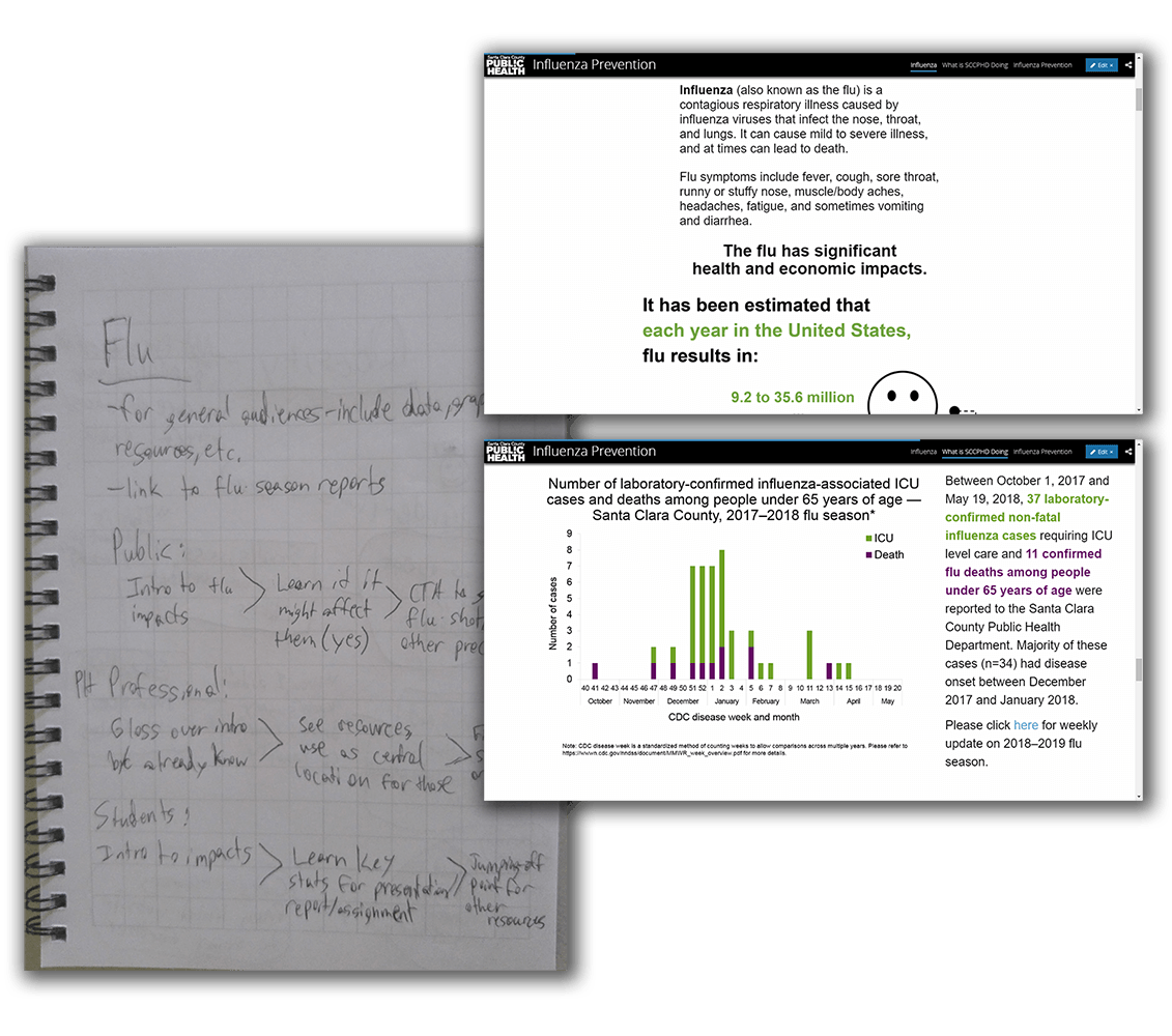
Influenza Prevention
The universality of the flu became a generalized, well-rounded story, with an even mix of graphics, data, and further resources.
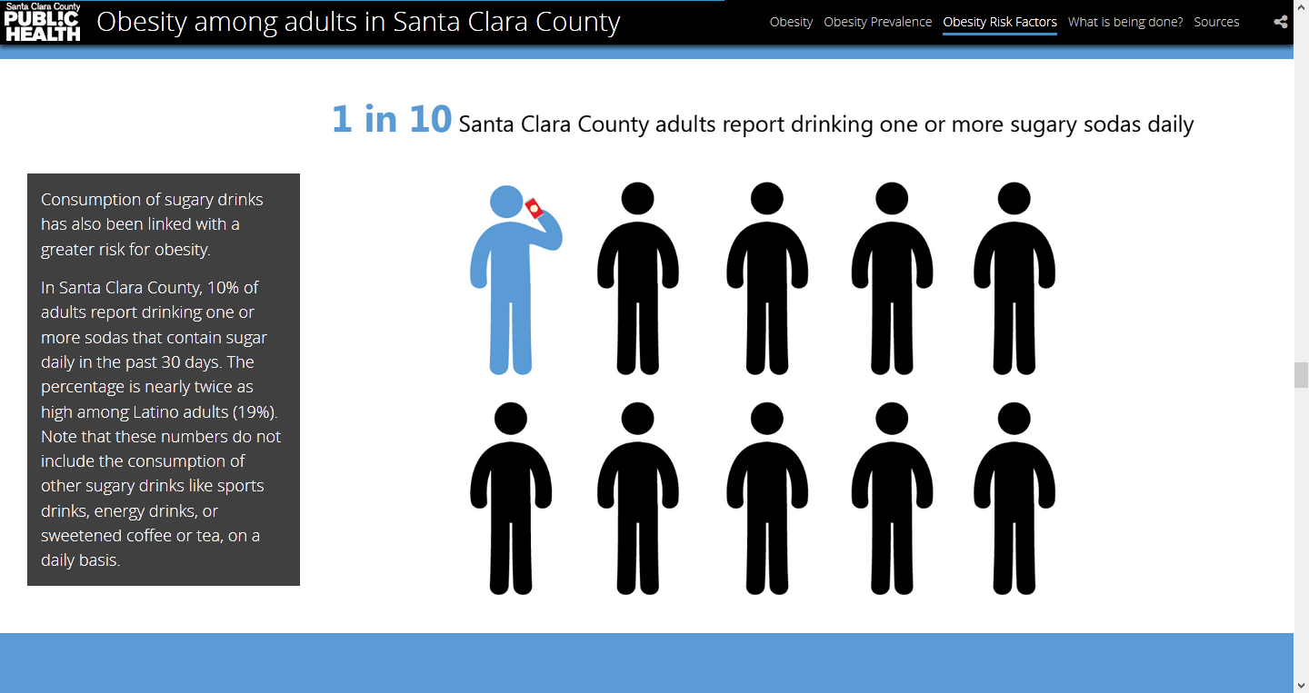
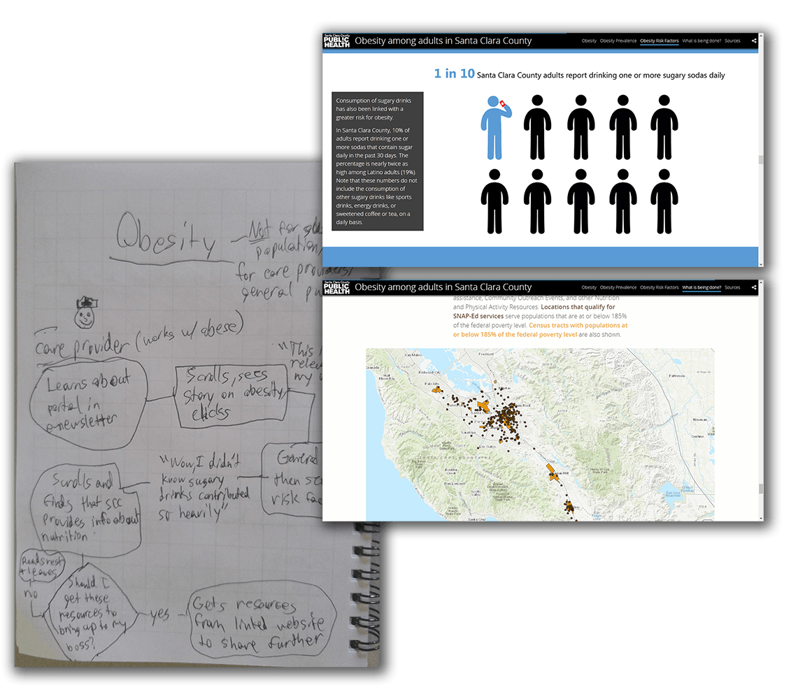
Obesity Among Adults
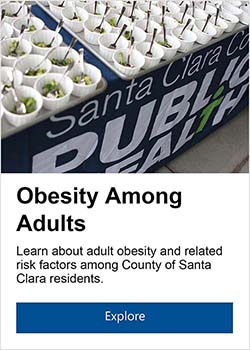
The pervasiveness of the obesity epidemic became a friendly, graphic-heavy design with an outreach map at the end for the user to check out programs in their area.
Data and Media Consistency
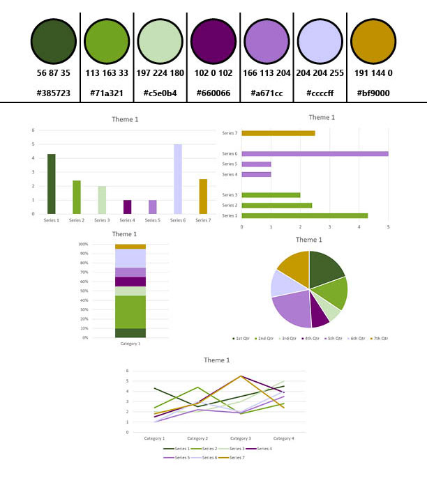
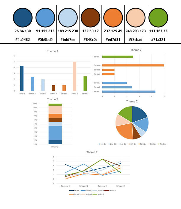
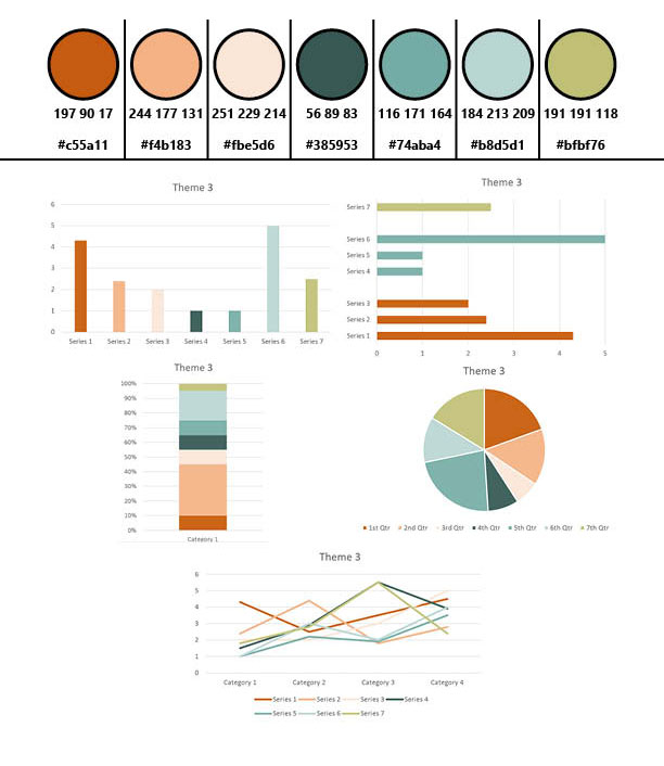
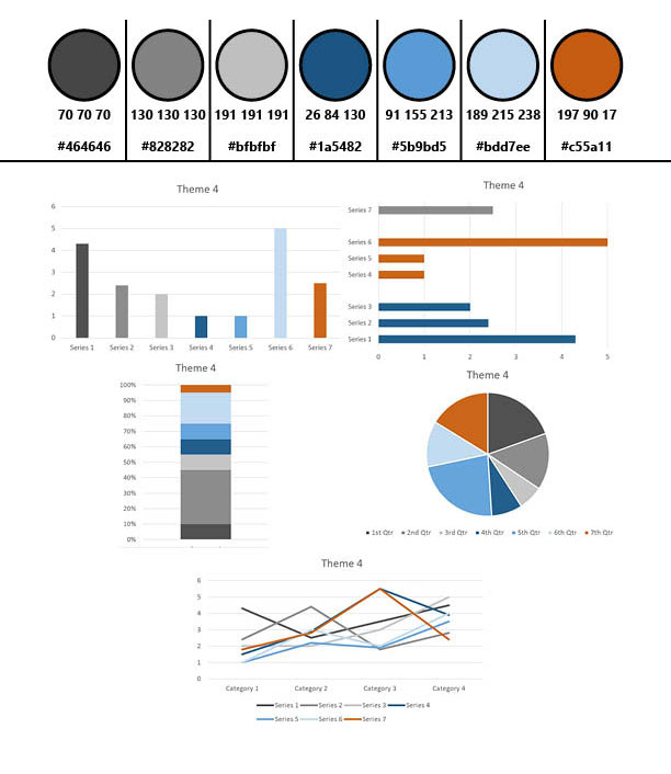
I initiated the creation of four styles for each of the data stories, which permeated through the containing elements, data, media, and text. They were based on department brand colors, and conveniently could mostly be constrained to Microsoft Office default colors for ease-of-use and application by my coworkers. Each data story was given a style based on its contents.
Integrating the Portal
How do we reach these target users?
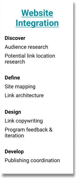
As the launch date got closer, I became involved with planning how to successfully integrate the new Open Data Portal website with the existing SCC Public Health Department website. I began with a thorough search of the existing website for potential link locations, as well as by asking some questions of various programs’ web managers about why they think people most often go to their pages on the website. I tried to understand which part of the users’ journey might take them to different sections, and what they might be in the process of looking for, in order to better place links to the portal.
Site Mapping and Link Architecture
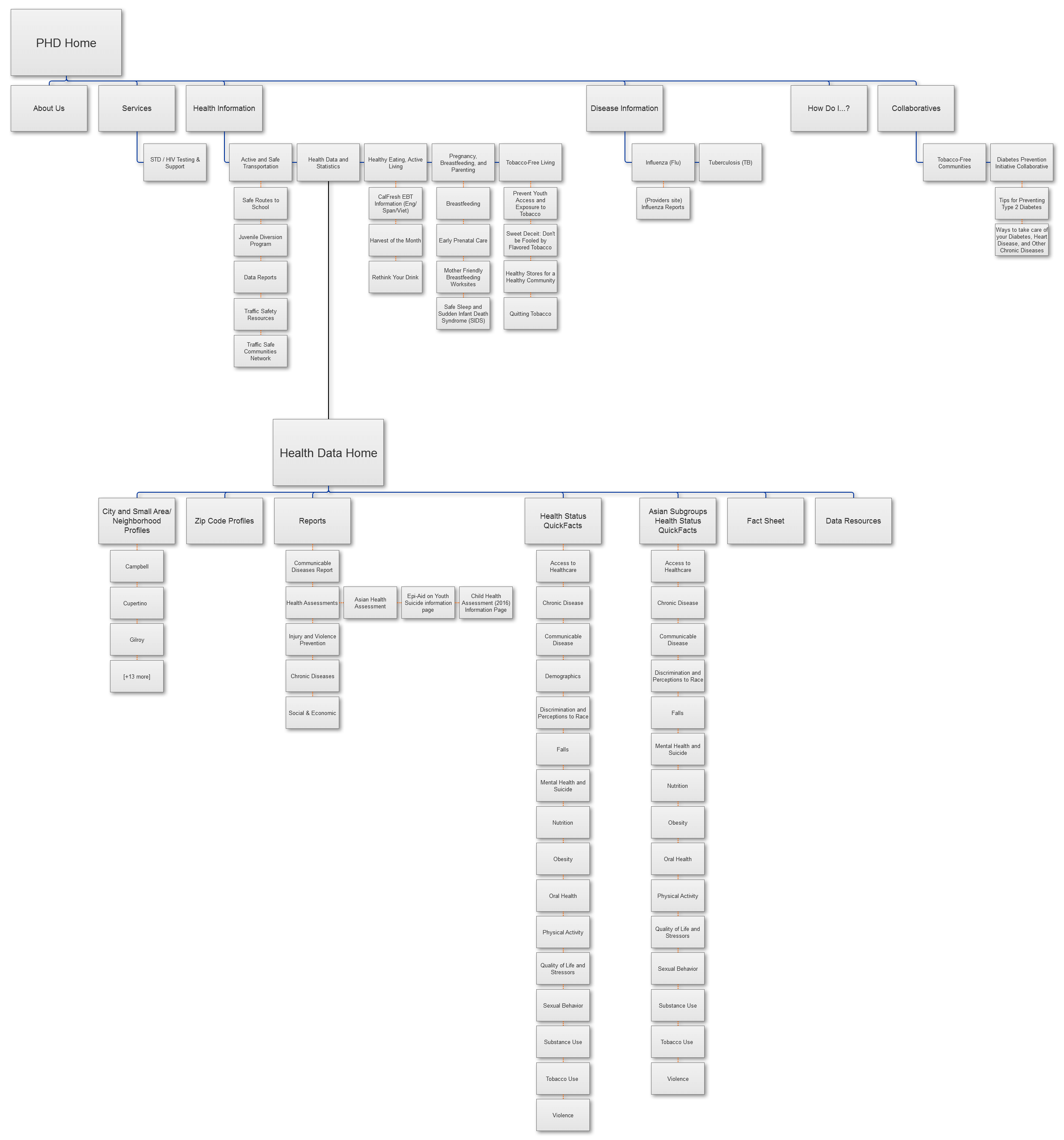
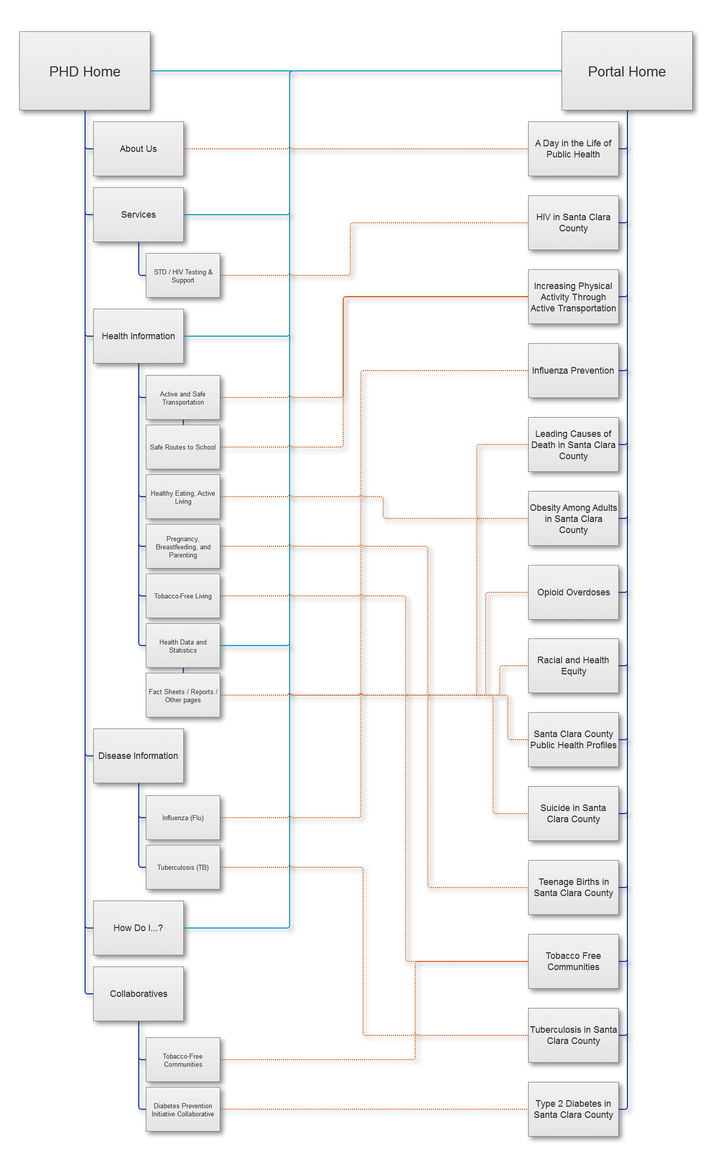
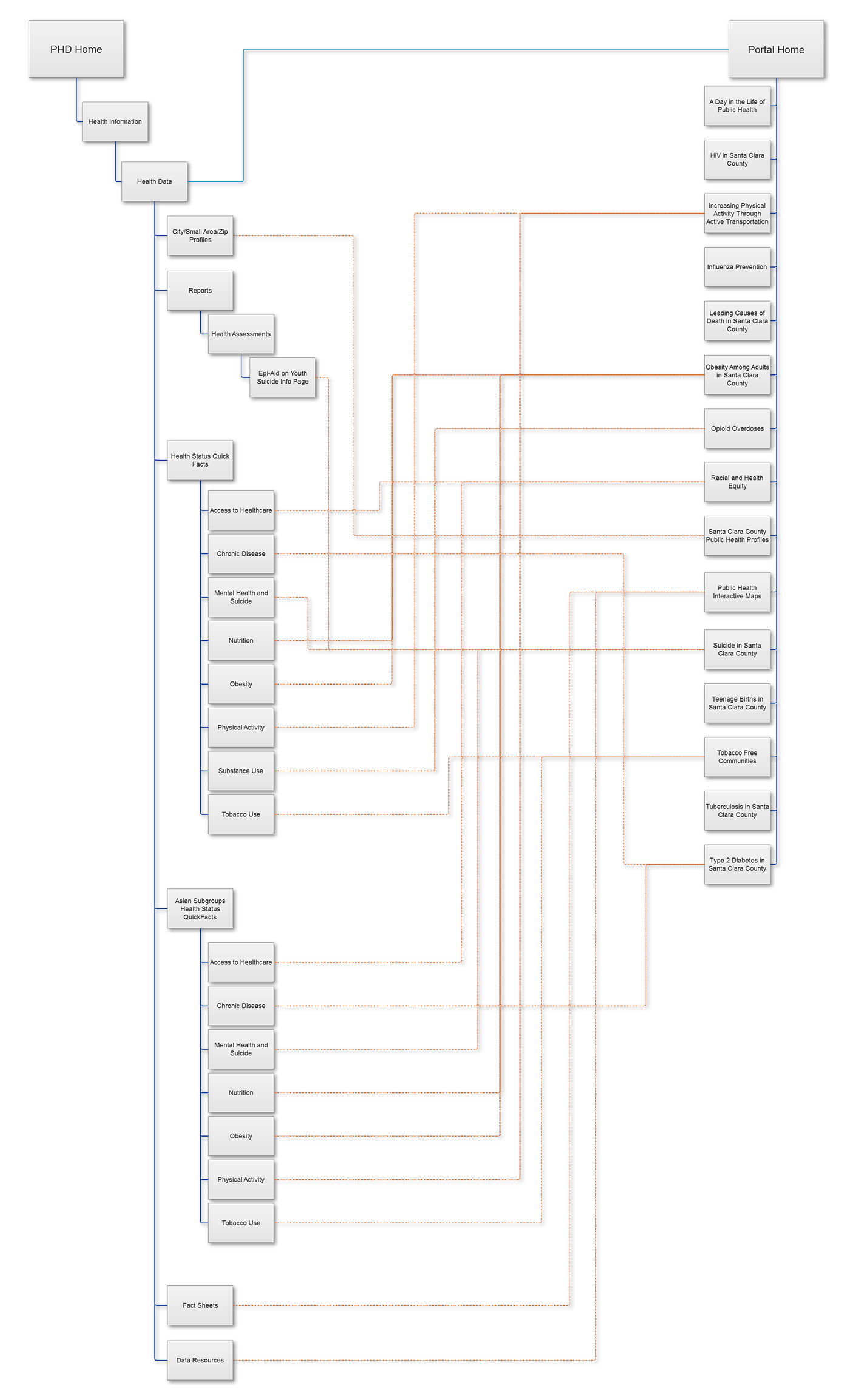
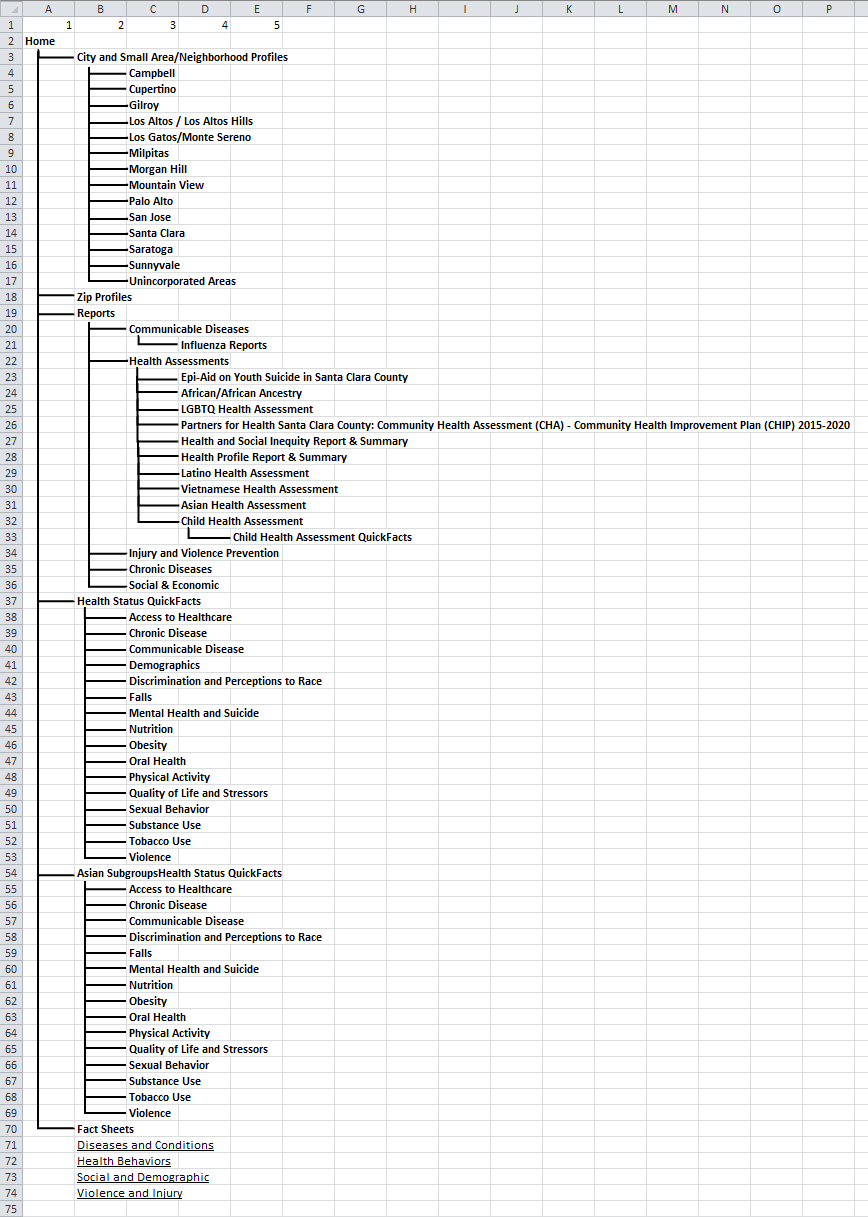
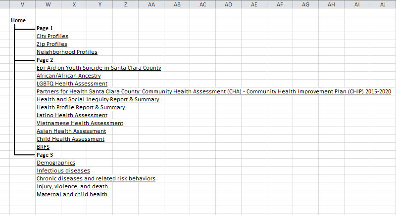
Using a reduced sitemap I had created, containing all relevant pages and subpages we were considering, I then went ahead and diagrammed the link architecture that we would need to implement. Return links from stories were considered on a case-by-case basis, as we already had lists of resources in place.
2 Types of Links
Links to the portal homepage were placed where it would be found as a database resource. These were:
- Hero slideshow image on the SCC PHD homepage
- An icon on the “Popular Services” section of the homepage
- Text link on the “How Do I. . .” page under the "Learn About" subheading
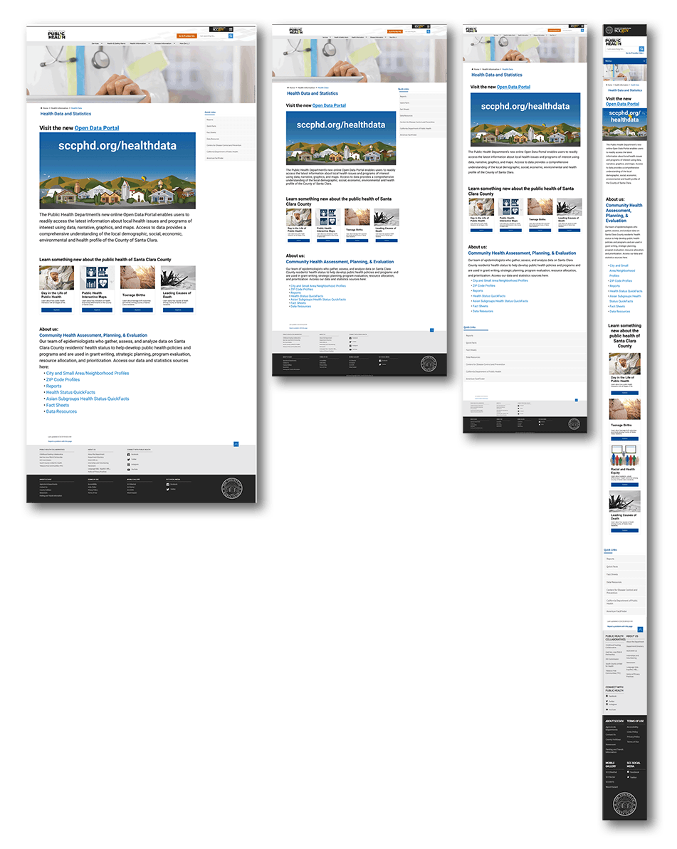
- Graphic and text links on the Health Data subsite
Links to individual data stories were placed as educational introductions to learn about various health topics. These were placed on various program pages that we had developed stories with, as well as:
- Link to the “Day in the Life of Public Health” story on the “About Us” page
- Link to the “HIV” story on the “STD/HIV Testing & Resources” page
- Link to the “Type 2 Diabetes” story on the Diabetes Prevention Initiative Collaborative” page
- Link to the “Opioid Overdoses” story on the Santa Clara County Opioid Overdose Prevention Project (SCCOOPP) page
- Link to the “Suicide” story on the “Data and Evaluation” subsection of the Behavioral Health Services’ “Suicide Prevention & Crisis” page
And a New Front Page
I redesigned the Health Data home page to host a large graphic link to the portal, as well as several data story links. We tried several options with one or two rows of stories, and different positioning of the original text regarding who the team was and links to work.
Eventually, we decided on placing the new content first, then data story links, then original text and links, due to the long-term goal of the portal becoming the primary health data resource for Santa Clara County.
Data Story Link Copy
What do you want to learn about today?
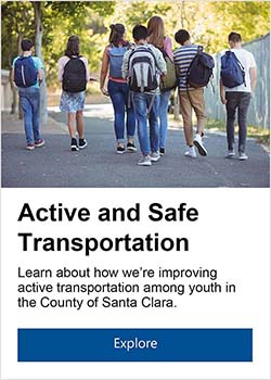
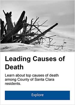
While the text link copy was more or less determined by what we already had written for various Open Date Portal communications, the data story links still needed copy to pique interest and summarize what the user would find on the other side of the click.
Through 1-2 rounds of feedback, involving my team (Epidemiology & Data Management/Community Health Assessment, Planning, & Evaluation), the communications team, and the web managers of relevant programs, I wrote a series of descriptions conveying that these were educational introductions for those interested in learning more about a particular public health target area.
Information Architecture Redesign
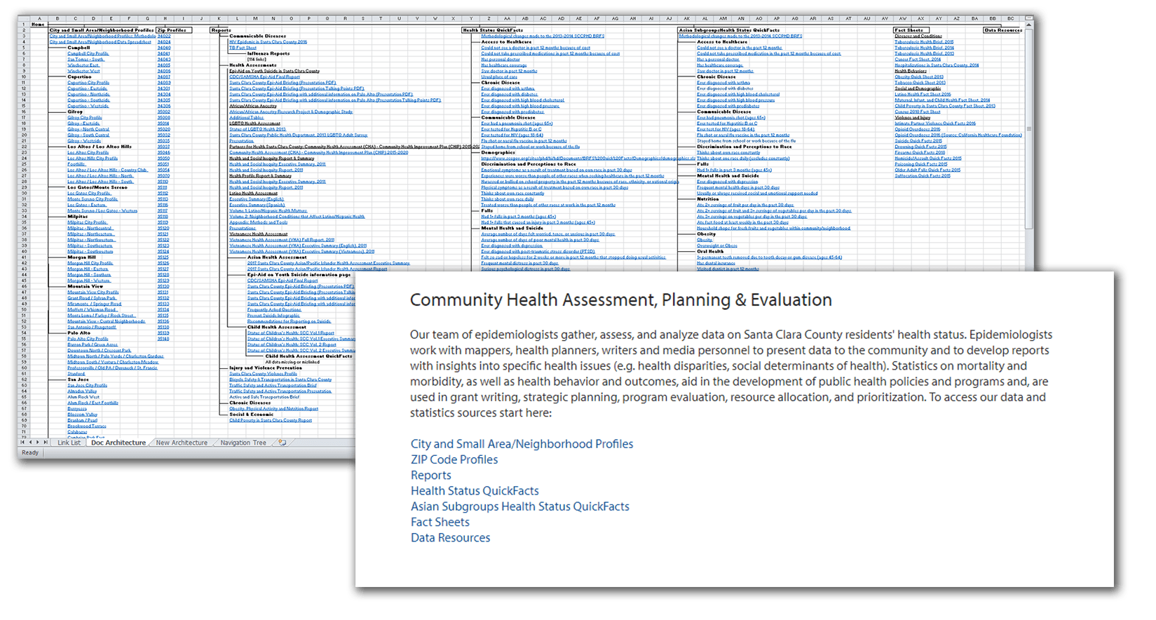
As we worked to integrate the two websites, we began looking at the existing structure and document categorization of the SCCPHD website, which were both in need of revision. Eventually, all data was to be transfered over to the portal, and assessments, reports, and other documents kept on the old website.
Goals
- Simplify the 4-5 page deep navigation structure
- Detect and correct confusing titling, page structure, and document architecture
Defining Our Users
Many of our regular visitors were largely known to us, through joint work or data requests. Starting from these groups, I defined several base personas that represented our users. These were also factored into later work defining the Open Data Portal’s users, as they are likely similar people.
Anne | 41
“I’d like to reference accurate, useful health statistics quickly and easily.”
- Program specialist, who assists with outreach at a local nonprofit organization
- Married mother of 2; lives in a small home with her partner
- Familiar with health data, due to her end-of-year reports, but doesn’t use it regularly
- Technically capable, but doesn’t work with especially complicated information or software
Mental model
“This website is like a library for health data. I need to look for signs and labels that are related to what I’m looking for, and I’ll find it there.”
Jobs to be done
- She wants to find the statistics she’s looking for quickly and without much effort.
- She wants to ensure the statistics she finds are verifiable and citeable.
- She wants to bookmark or save the statistics in some way for future reference, just in case.
- She wants to complete her project to a level of quality sufficient for her manager.
Patrick | 28
“I’d like to add another resource to my list of legitimate data sources.”
- Pharmacist who works at a public clinic.
- Single, lives with a roommate in a 2-bedroom apartment
- Works with health-related data on a regular basis, typically to do with disease rates and hospitalizations.
- Technically competent millennial, works with Excel regularly and various online databases
Mental model
“This website is a resource for local health data. I can type a query into the search bar and find relevant data.”
Jobs to be done
- He wants to find a robust resource he can reference on an ongoing basis.
- He wants to use the resource for more locally-relevant data, but to go elsewhere for state- and country-level data.
- He wants to be able to use specific keywords to search for what he needs, as he’s accustomed.
- He wants to know that the data is verifiable and citeable.
- He wants to complete his work to a level of quality sufficient for his manager.
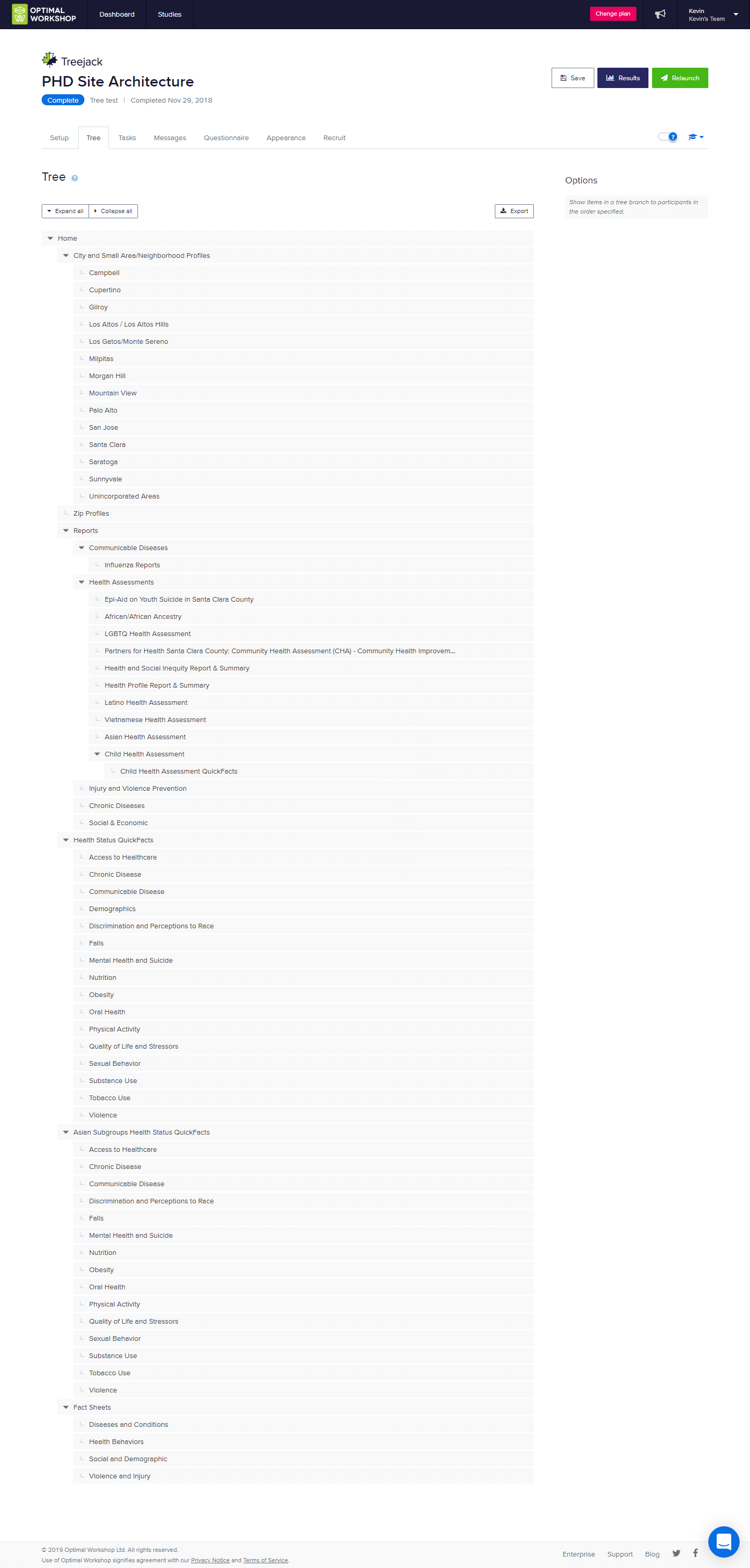
Tree Testing the Old IA
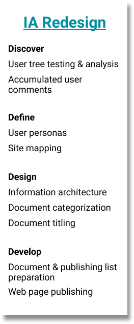
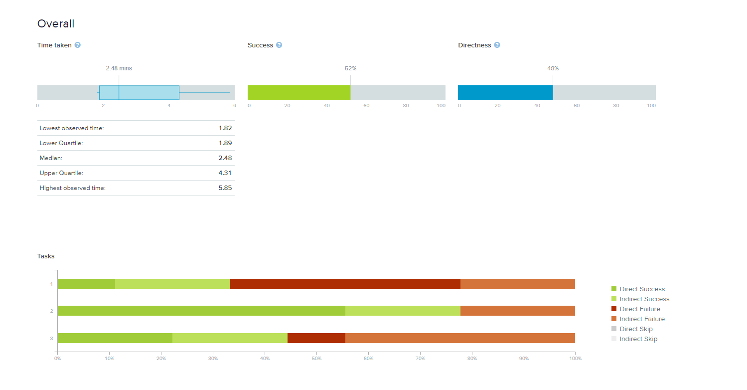
I set up a simple tree test to explore different confusion points as they pertain to finding specific information in our navigation hierarchy. We contacted several acquaintances to take the test, people who hadn’t used the Health Data subsite before. Tasks were inspired by our newfound personas, as well as several complaints we had received previously from users trying to access data on our website.
Tasks
- You work in a flu shot clinic, and want to find out some up-to-date flu season statistics that you can include in your public messaging.
- You had previously used the most recent Child Health Assessment as reference for a report on healthy growing environments, and now would like to download the raw data from the assessment for use in a presentation.
- Your Vietnamese community has been experiencing a string of racial incidents at several restaurants and small businesses. How would you find out about the effects of Vietnamese discrimination in Santa Clara County?
Found Pain Points
- Locations of different types of documents on the same topic were frequently mixed up
- Overall, there appeared to be confusion between “Assessments”, “Reports”, and “Fact Sheets” document classifications
- Once past the top nav level, users found what they were searching for relatively easily
Content & Structure
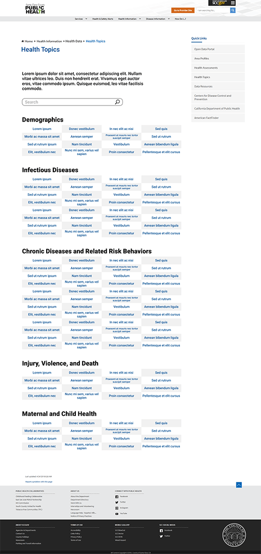
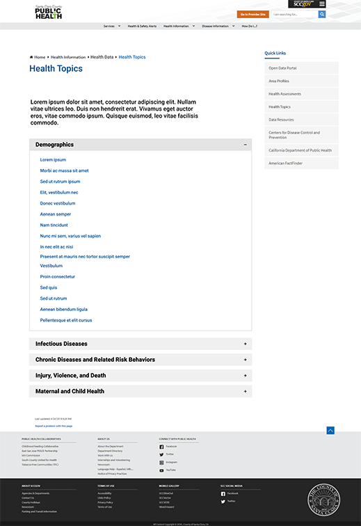
Considering the research findings and personas, we set out to organize and retitle all documents in a way that would make sense. We settled on grouping documents into 3 categories: Area Profiles, Community Health Assessments, and Health Topics. Reasoning was that those looking for specific location-related data, those looking for large collections of related data, and those looking for data related to a specific disease, health determinant, or other topic, made up the majority of our users as far as we were able to verify.
Design options were somewhat limited by the SharePoint system our website is built on, and ideas boiled down to either a table structure with a localized search bar, or an accordion structure without search capabilities.
We ended up going with the former for a number of reasons, among them the number of documents that would be in each category, relative importance, and points of confusion from the tree test. We’re currently working with two web developers from the Information Services department to implement these changes, which will go live once our extensive library of documents is cleaned out, organized, and prepared.
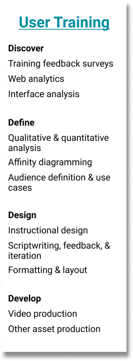
User Training
The initial plan following the release of the portal was to be a series of live, in-person trainings for different teams and programs, lead by several of our epidemiologists. We had received feedback that many users, including some who had received training, were running into issues with accessing data. This prompted me to look into creating a more robust online training presentation, as at the time we had only a simple how-to PDF with screenshots and directions.
Survey & Website Analytics
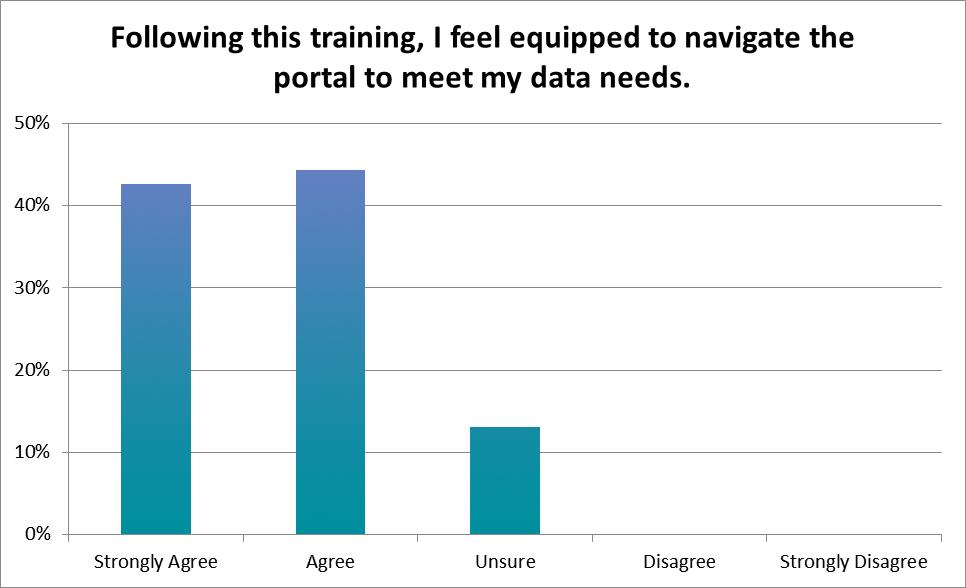
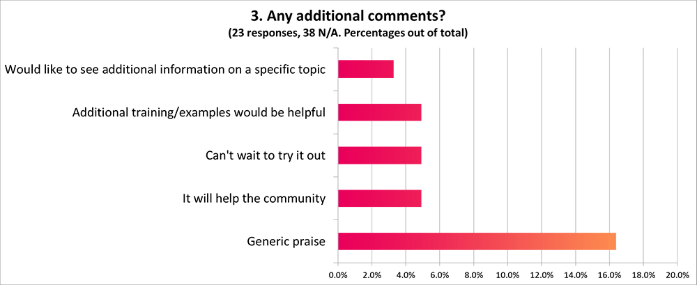
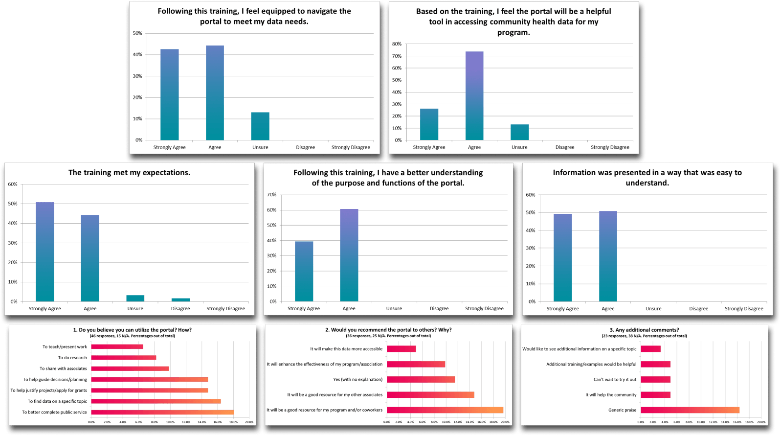
A significant amount of respondents to our post-training survey indicated that they were still unsure if they were ready to navigate the portal, and a common theme of one of the free response questions was that more training would be useful.
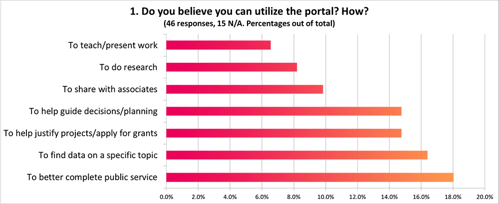
Several common themes among free response answers also indicated that most use of the portal would be relatively surface-level, and a range of use cases implied that a more robust presentation would be useful.
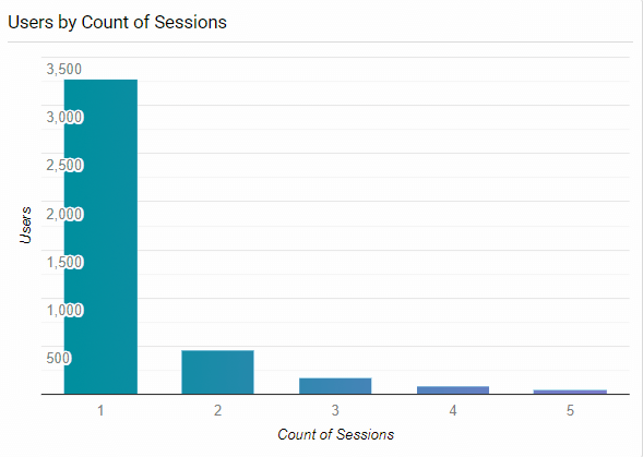
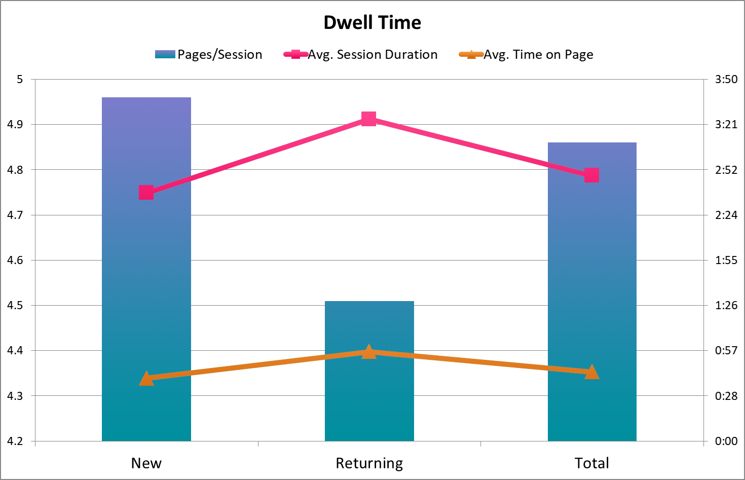
Existing profiles of our users for the most part consisted of those who use data on a case-by-case basis and those who are very involved with health statistics as a whole (and likely familiar with this type of online database). Two key findings from our web analytics that confirmed this distinction were:
- The distribution of user session counts
- That the returning users group, despite having a much higher bounce rate (counting as 0s) and fewer pages/session, had a 49 second higher average session duration overall, with a 17 second higher average time on page among non-bounce sessions.
Occasional surface-level vs. in-depth, long-term use
These findings, combined with pages viewed/pathing/click events by new and returning users, among other metrics, helped determine that there were a relatively small number of heavy users, who were dwelling on particular dataset pages to either reference or filter and download, and coming back repeatedly to do so. As a result, we focused on users who'd only use the portal for reference occasionally as the primary audience for a tutorial because, again, many of the heavy users would have experience operating similar systems.
Designing the Presentation
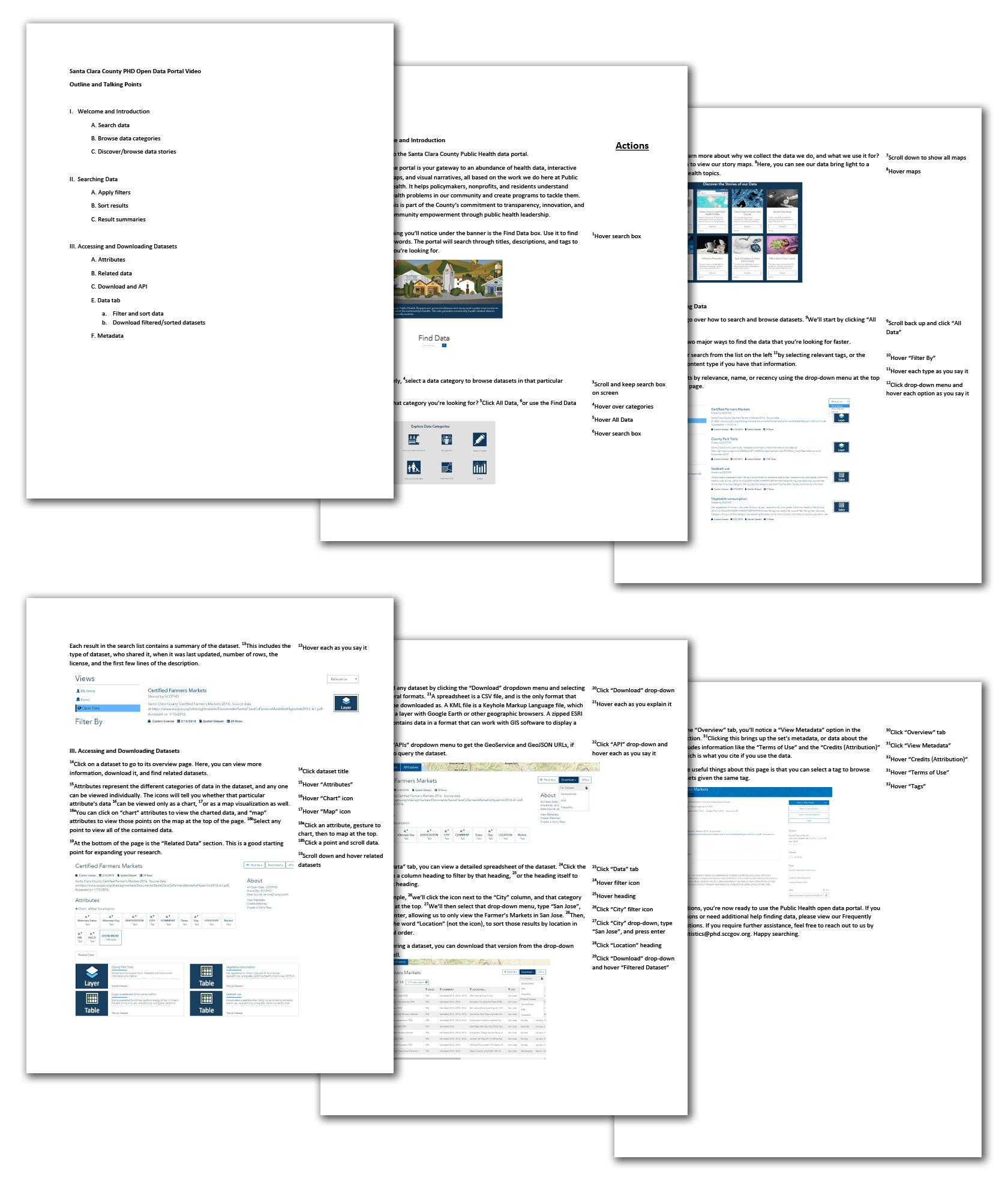
Utilizing the research findings, as well as the previously-created personas, I began writing a script for a screencast that would make up one-half of the presentation. Based on audience expectations, it was limited to crucial procedural information and divided up by page, ordered as someone would likely experience it while looking for data for the first time.
Through several rounds of feedback involving my team, communications, several higher-level managers, and the Public Health director’s office, a satisfactory script was produced, which was used to record and produce a screencast that walks the user through how to find, access, and download health data.
Designing for different use cases
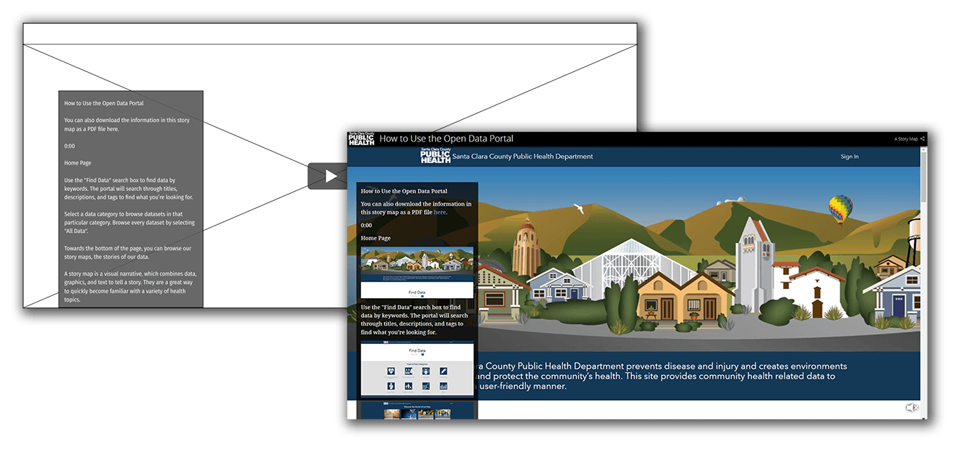
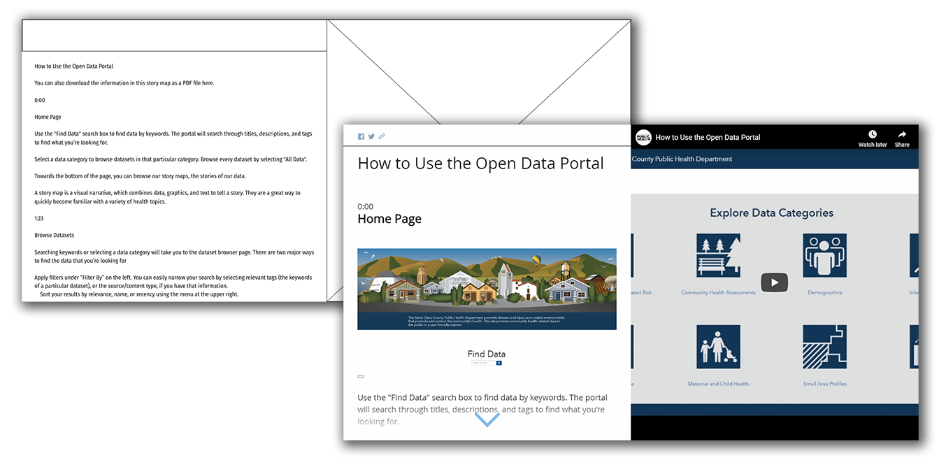
The presentation was designed to be useful in the two main use cases: as an introduction, or as a reference. This was primarily accomplished by keeping the presentation relatively short (~6min video), and by timestamping each section, right next to a screenshot of the relevant page, for easy finding of what the user may be stuck trying to do.
It was also made immediately clear the training was available as a PDF, for instances where the user wants to have an offline or physical copy.
Final Presentation
<- Expand window to view ->
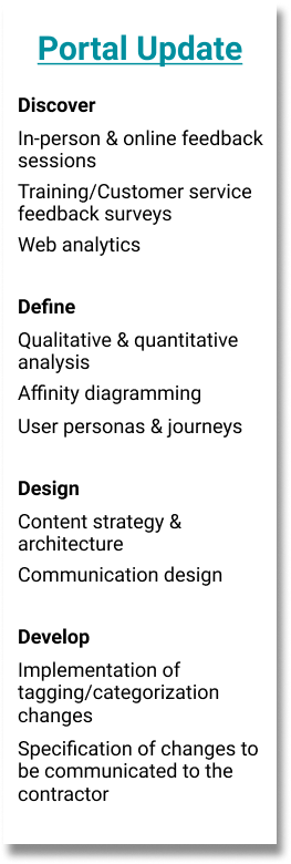
Evaluation & Update
As our launch initiatives wrapped up, we entered the post-launch evaluation phase, and began looking for directions to improve down the line. This process cycle is still ongoing, currently at the point of defined improvement ideation and evaluation.
Qualitative Research Activities
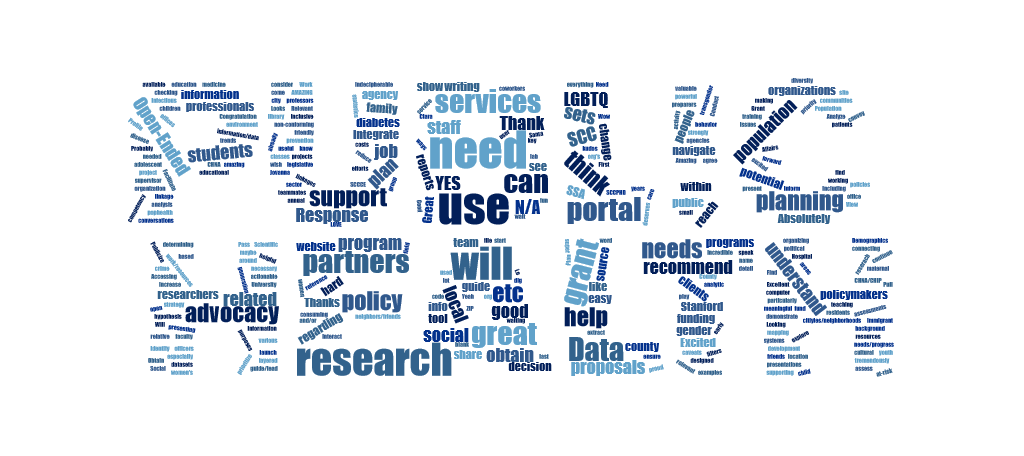
Beginning with feedback surveys sent out following portal training sessions, we began collecting information on what people thought of the training, and of the portal overall. These surveys included questions about predicted use of the system, and how ready people felt to access it.
Our annual customer feedback survey also included several questions regarding the newly launched portal, along with the typical questions regarding our team’s main public-facing function, data requests. These provided insight into the existing process of disseminating these health datasets, as well as the base level of awareness about the portal.
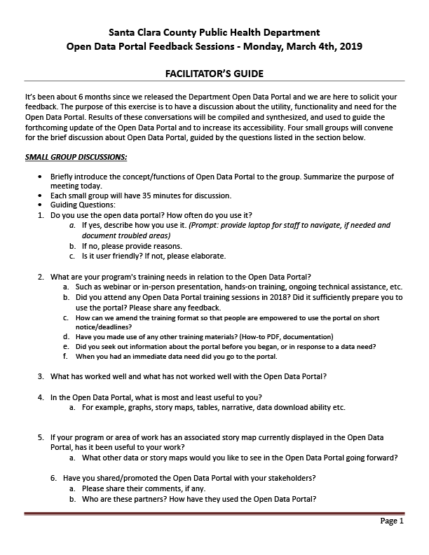
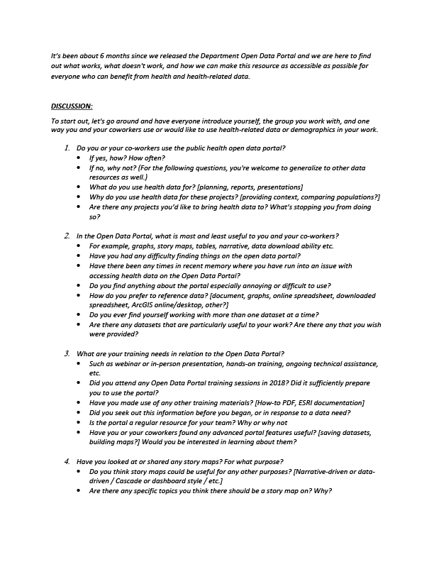
We organized 2 feedback sessions, in order to interview a variety of people about their use of the portal so far, or lack thereof.
The first session occurred during the quarterly PHLT (Public Health Leadership Training) meeting, where we had the opportunity to conduct group interviews with 35+ people, coming from several different branches of Public Health, and including nurses, social workers, program managers, and upper administration, among many others.
The second session took place online, and included 6 respondents to an email sent out to attendees of the portal launch event. It was conducted through GoToMeeting, and provided feedback regarding current data use and resources.
Findings Analysis
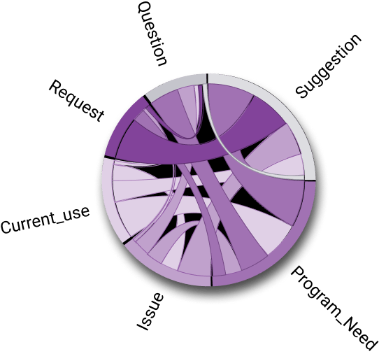
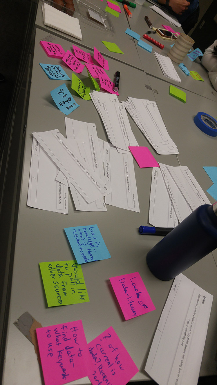
We’ve received 67 total responses and 119 individual comments on our training survey so far, distilled 139 concrete observations from the PHLT feedback session, and 44 from the online session. Optimal Workshop’s Reframer was used to tag and analyze all of the findings, which were then formatted in InDesign and printed for use in our portal improvement meetings.
Personas and Journeys
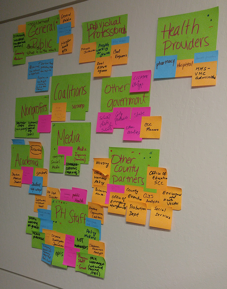
Our first meeting consisted of brainstorming who our users were, based on session findings, background knowledge, and previous interactions.
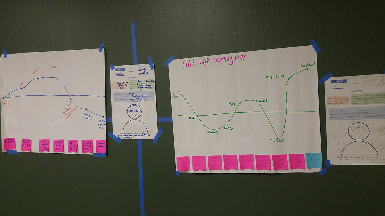
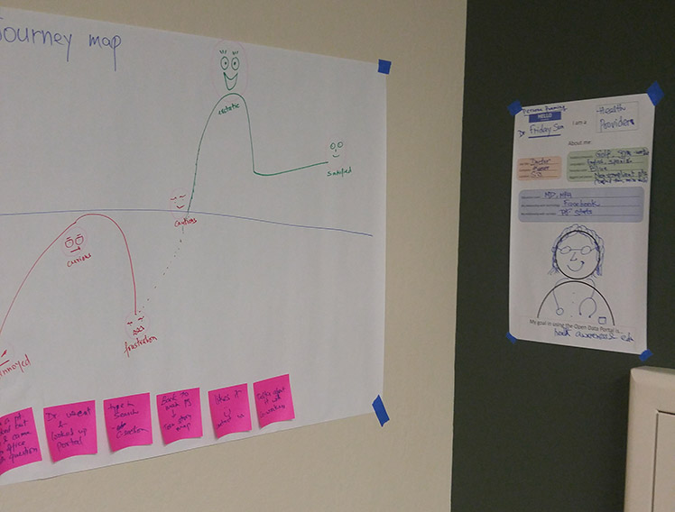
We defined 3 target personas from our ideas, mapping each one’s journey through interacting with the Open Data Portal.
This served to provide concrete individuals to keep in mind for the rest of the process.
Affinity Diagramming
After the meeting, I referenced my notes in order to refine an extended affinity diagram that I had started earlier on during my initial findings summary. It became a foundation for generalizing pain point themes and other commonalities.
Issue Validation
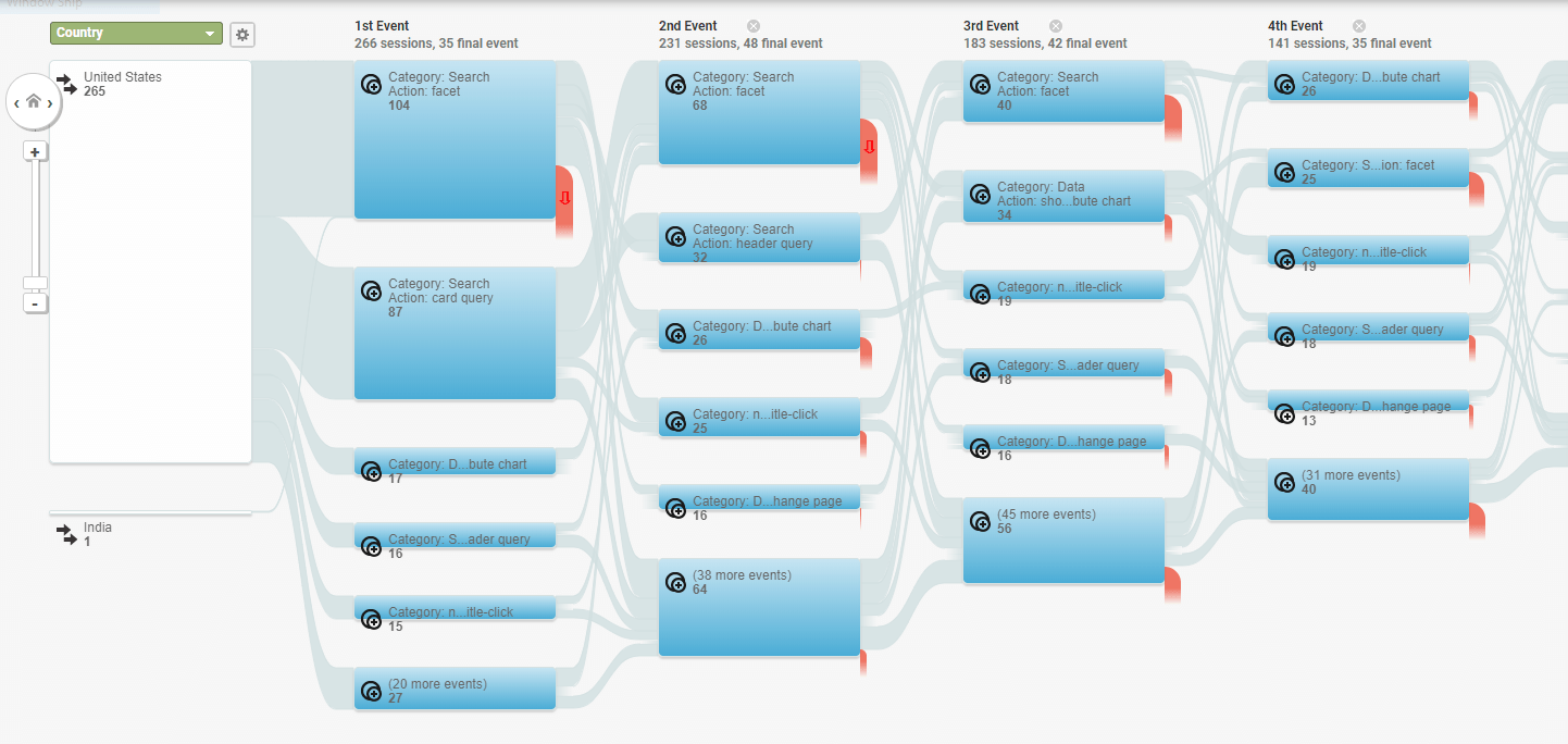
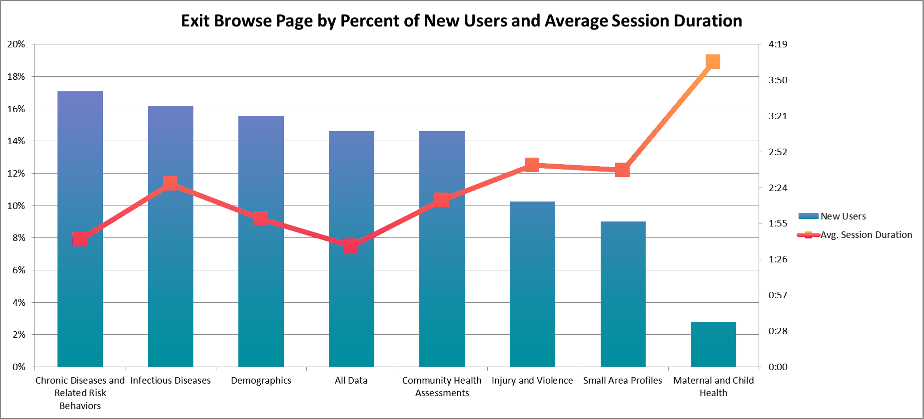
We utilized quantitative web analytics to validate some of our concerns after the first portal improvement meeting. I gathered information from our accumulated metrics, attempting to generalize specific problems, pointed out through qualitative feedback, to larger portions of our user base.
Some of the metrics we looked at were:
- User pathing – How did users look for particular datasets? Did they prefer to search or browse?
- Search keywords – Which keywords did users search for? Did they revise their searches or give up?
- Landing pages – Were a significant number of users landing on individual dataset pages, presumably as bookmarked references?
- Exit pages – Where were users leaving from? Home page, search page, main dataset page, spreadsheet view?
- Interactions with dataset “attributes” – Was this spatial reference feature being utilized, or were brought-up pain points too much of a deterrent?
Impact Analysis
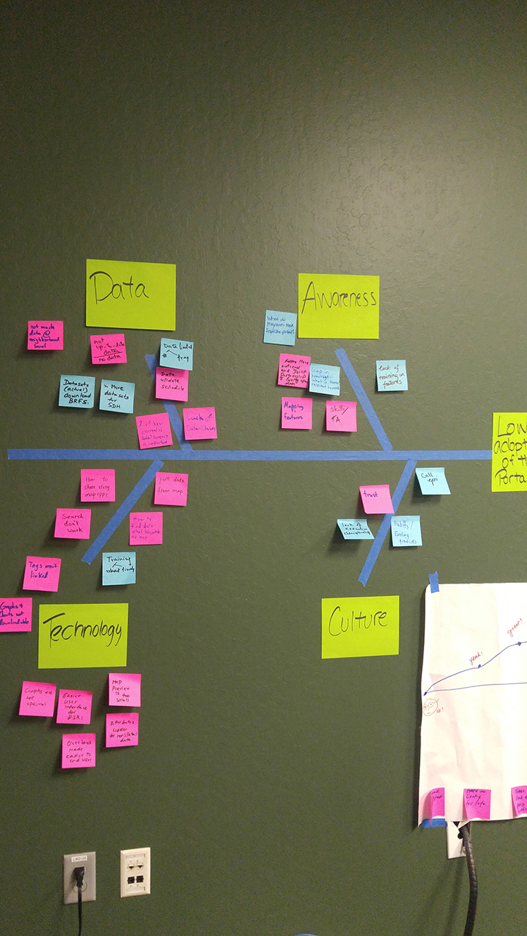
Through our previous session and resulting validation, we specified the biggest problem we were having was to do with adoption of the portal as a new resource. Utilizing a fishbone diagram, we attempted to group these smaller issues within those bounds.
From this exercise and further discussion, we found several points of impact to affect the user experience through:
- Dataset tagging and categorization
- Dataset content and descriptions/metadata
- Dataset interlinking with external resources
- Rewording of copy to be more user-friendly
- Other content e.g. documents, web maps/layers
- Existing and future data stories/content
- Portal/data communication directly (i.e. through email)
- Portal/data communication indirectly (i.e. through the PHD website)
- In-person and online portal training
- Work with Esri/Information Services to customize the interface to better suite our needs
Change Ideation & Feasibility
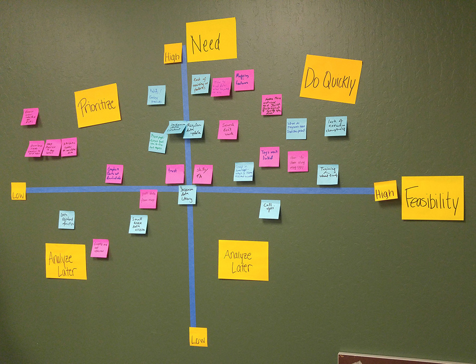
We then took the sticky notes from the impact analysis, and charted them on a need/feasibility matrix in order to visually prioritize each problem.
With the findings from this session, I came up with several specific, concrete changes we could conceptually make, charting each on a user value/feasibility matrix. These will be utilized during our next session to further define necessary steps and timeframe for each.
Most Realistic Changes
Personalize training presentations for different groups
Based on how much we personalize, from entire restructure(A) to changing out example datasets(B)
Survey programs for needed data and find a way to deliver efficiently. E.g. through data requests, email “showcase”
Outreach to community partners/schools/etc. about relevant data/data story resources
*Acquisition, not necessarily improving UX except for percentage of users
Further research into data story target audiences and redesign
Doing so for 1, up to 14 data stories
Retag datasets in accordance with goal completion locations, pathing-signified issues, and explicit complaints
Stretch Changes
Reconceptualize broad categories of data in accordance with what people are browsing to find particular datasets
Long-Shot Changes
The following changes would require transferring portal hosting entirely to the CoSC, and bringing a full-time developer on to implement them. For space and consistency, the obstacles to doing so are disregarded in the following charts.
Conclusions
While many of these ideas were good in concept, the infrastructure and support to actually implement many of these changes was unfortunately not available to me, which was one of several factors that eventually lead to me leaving the position. These research data and artifacts were produced for the health data team to consider in future portal updates. The experience facilitating a user-centered perspective where there hadn't really been one previously was a welcome opportunity, and although these exercises weren't as transformative as I'd hoped, SCC public health data resources were unmistakably improved in this regard.
