
Automotive Sales Aggregator Application
Overview
Budget Bucket (pseudonym) was designed for a freelance client with 15 years’ experience in the auto sales industry, whose goal was to create an application for the aggregation of reduced-price vehicle listings. Intended usage was as a demonstration tool for presenting to potential investors.
Project Goal
Design a researched, high-fidelity UI design ready to use to pitch to investors.
Duration
June 2019 — July 2019
My Roles
User/competitive research
UX design
UI design
Task evaluation
High-fidelity interactive prototyping
Competitive Research
Having been given a relatively vague prompt and a lenient set of guidelines for the app functionality and design, I began with a heavy look into other similar applications on the market. The client mentioned liking the functionality of the Autotrader app and the look of the Edmunds app, so I began my research there.
Autotrader
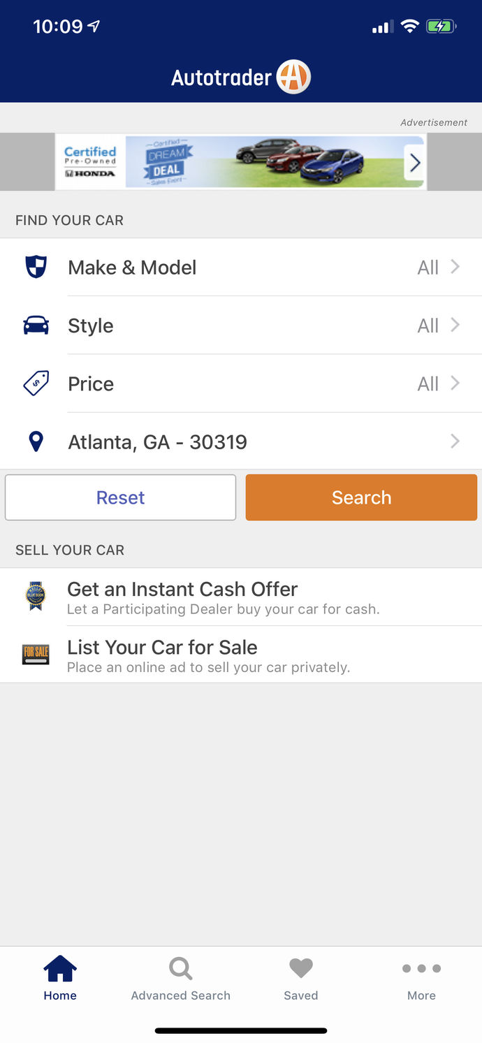
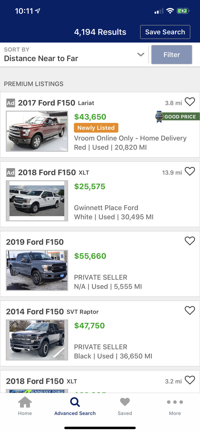
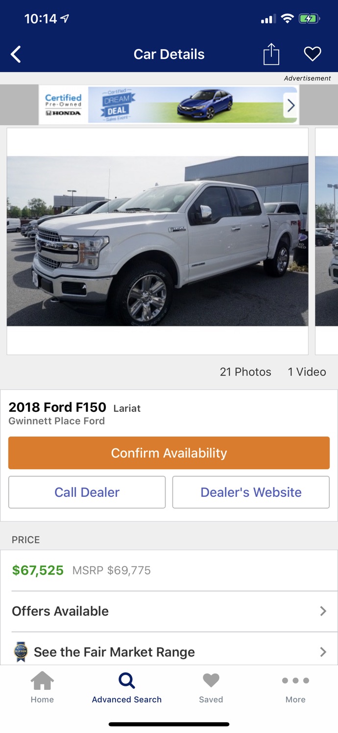
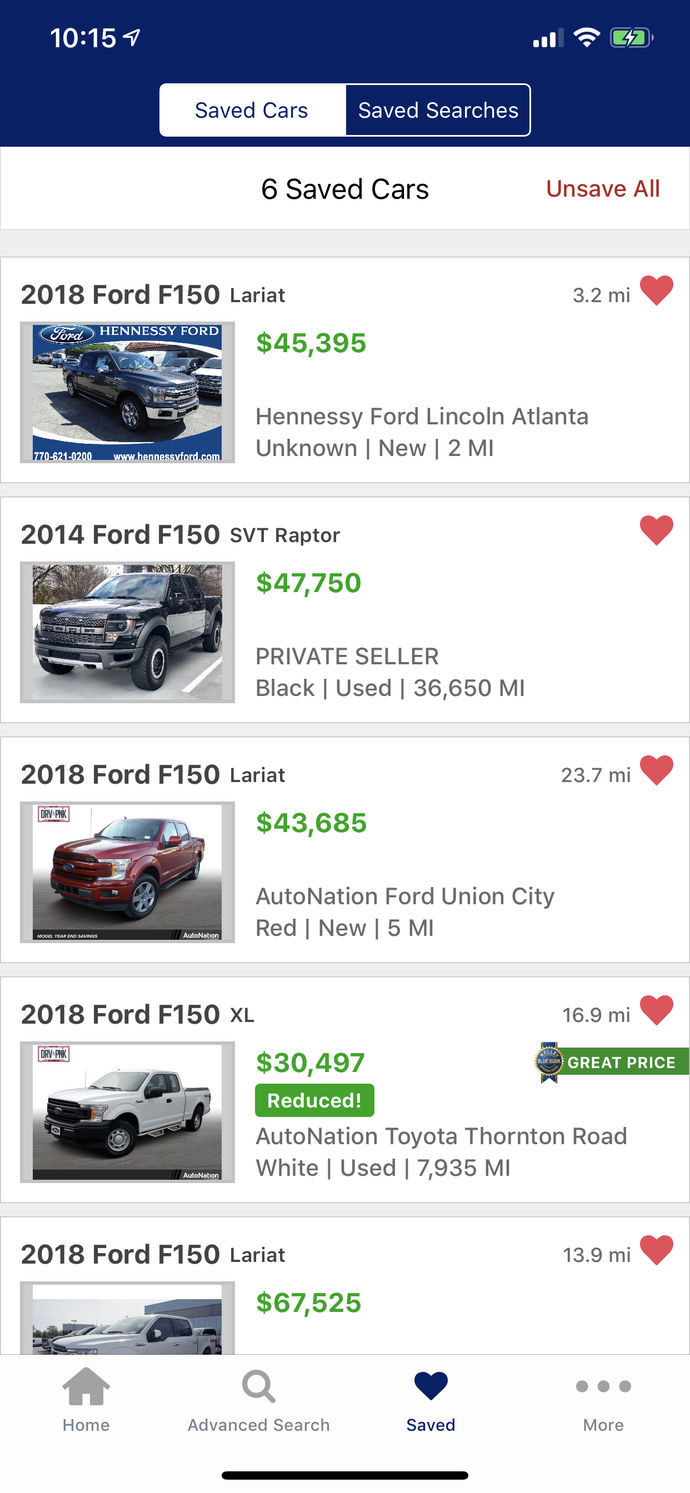
Autotrader provided a baseline by which to measure the general state of automotive sales apps on the market. This and others were relatively outdated design-wise, but offered important insight into functionality that was commonly desired by users, made especially apparent through app store reviews.
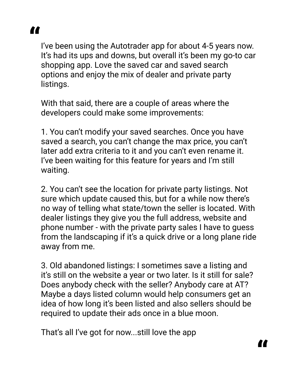
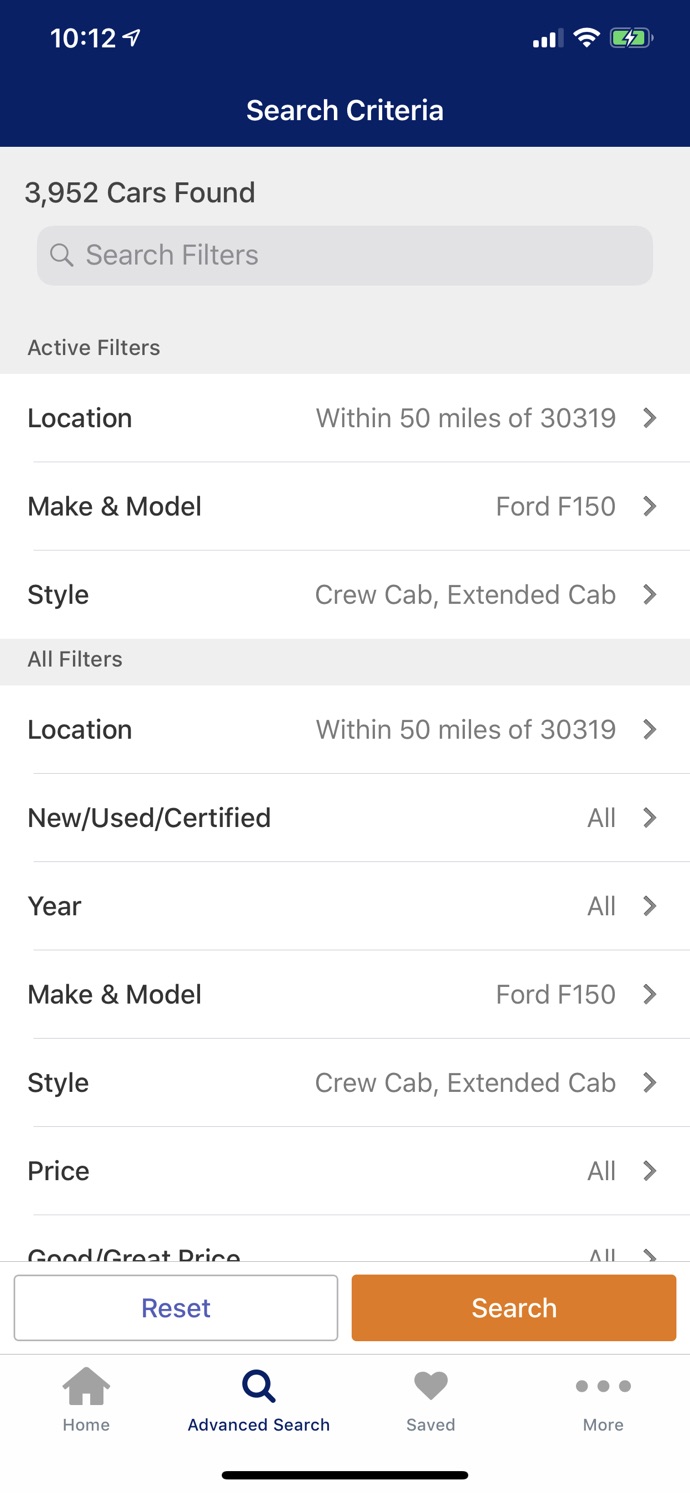
Some common issues with the app were modification of saved searches, and lack of important information collection. The structure of the application was relatively outdated, making use of a side drawer for all menu options, but several features such as the option to view all models from a manufacturer, and to dynamically edit searches in a side drawer, were popular with users and played into the design of the application.
Edmunds
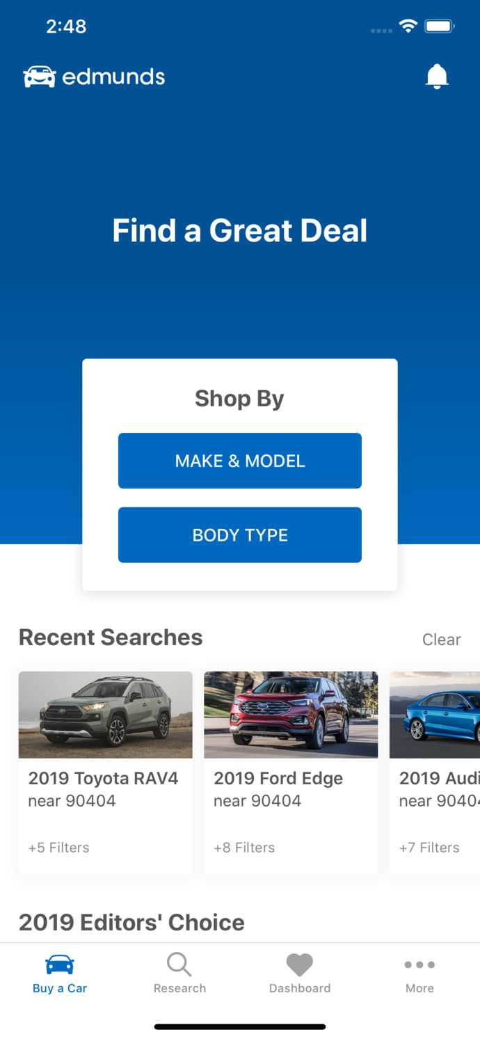
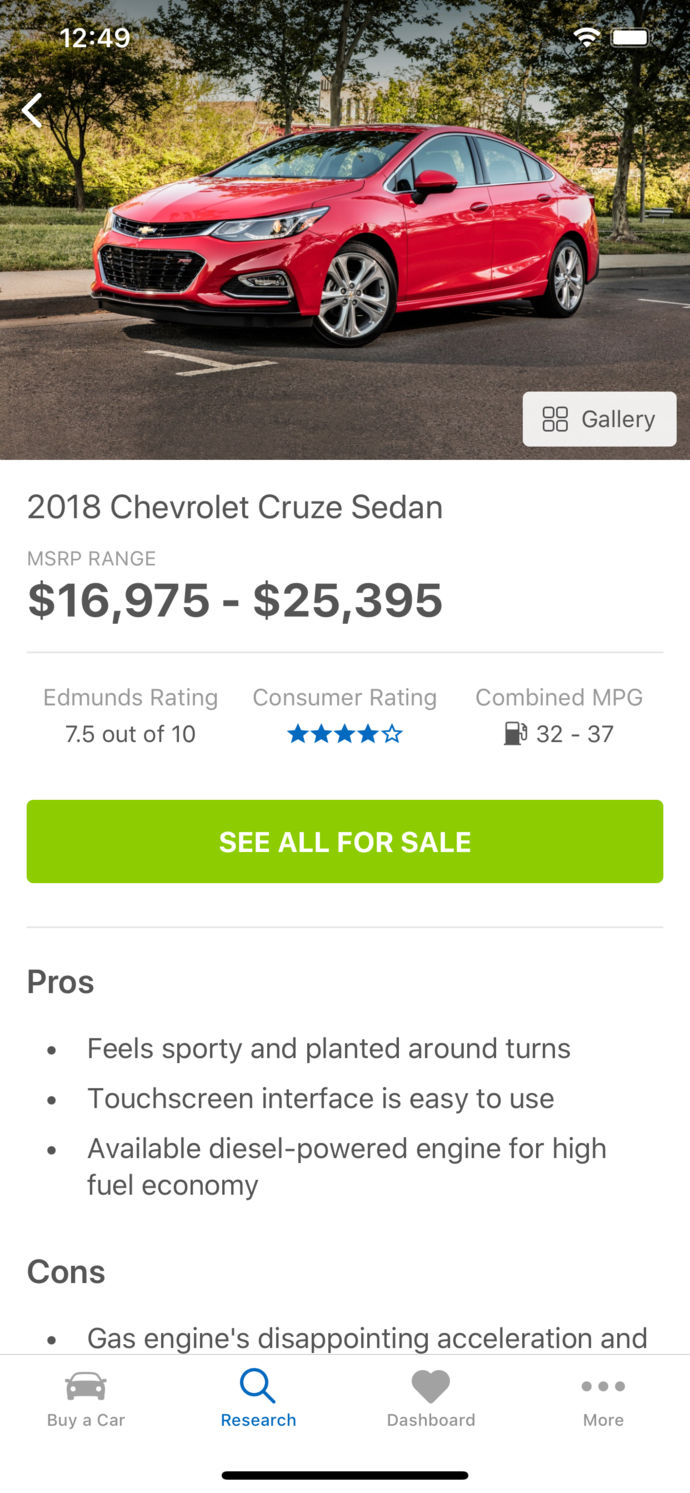
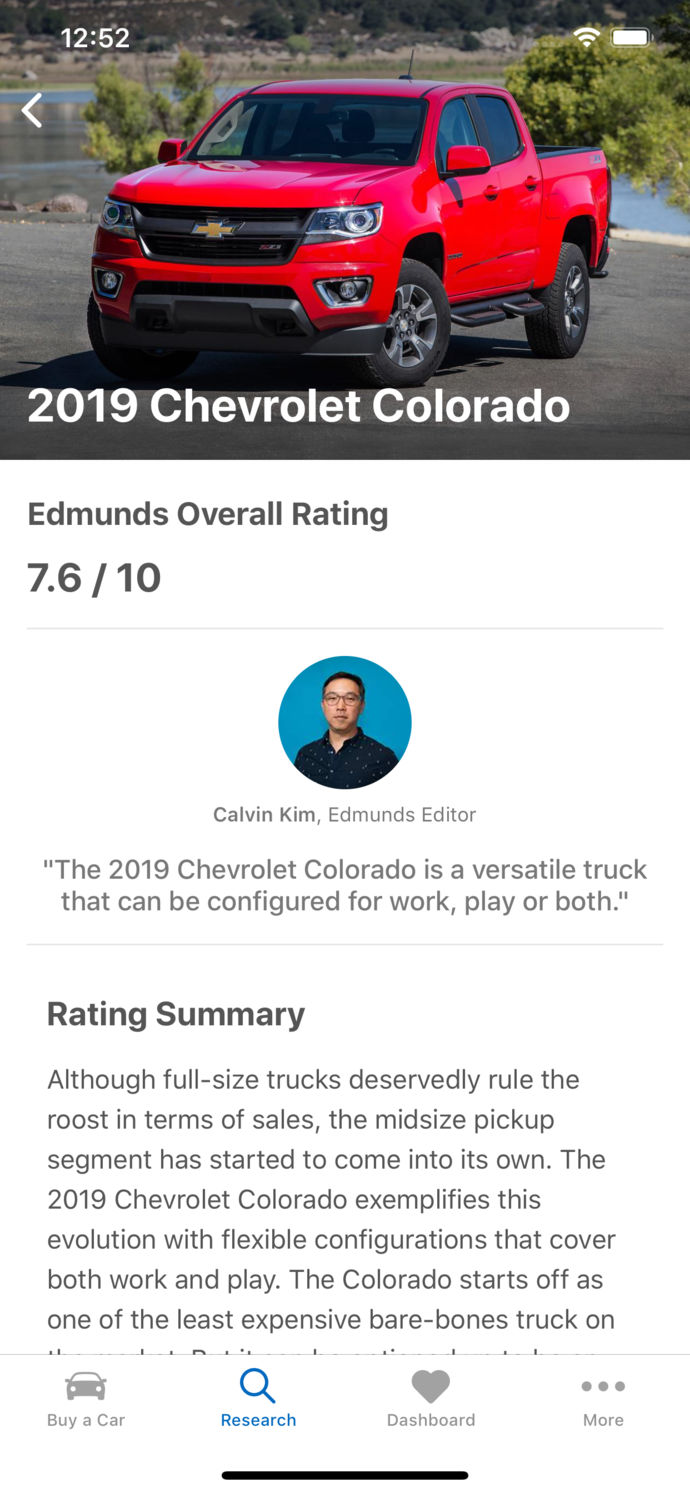
Edmunds had a much more modern design, but fell victim to several of the pitfalls of regularly-updated apps, namely removal or hinderance of popular usage patterns. As it was intended as a both a research and listings platform, some aspects weren’t as relevant, but overall painted a comprehensive picture of what users were looking for out of an automotive aggregator.
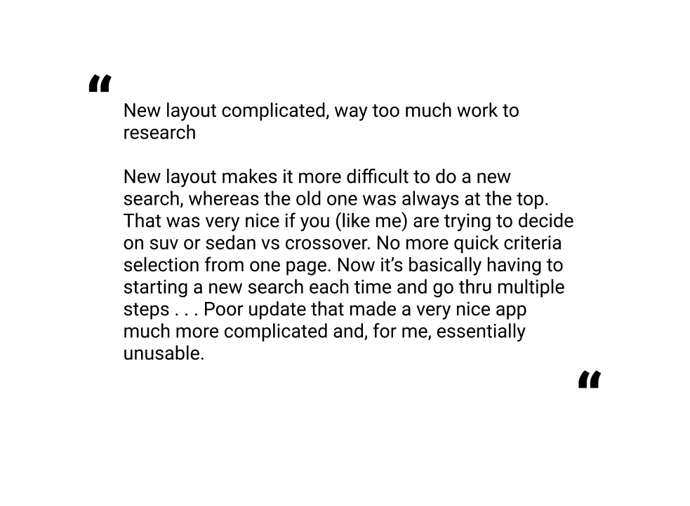
Several reviews summarized user sentiment towards a couple pain points brought on by recent design updates. A primary issue seemed to be the overly-structured search function, which required a user to go back through the entire process in order to change a single facet.
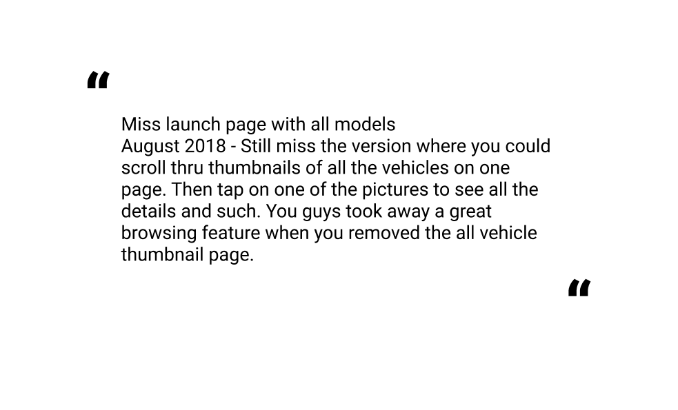
Another problematic aspect was the removal of an option to browse thumbnails of vehicles.
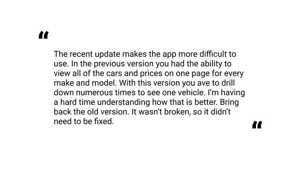
Overall, it seemed that the designers attempted to facilitate more targeted and specified usage patterns, which turned off many users who were looking for a more casual, browsing-based experience. This usage style influenced the final app design of Budget Bucket, as it’s a unique type of aggregator which lends itself more towards generalized as opposed to specified searching.
UX Design
After conducting secondhand research into user reviews of each application, as well as several others, I organized research findings into a more readable format, utilizing several UX methodologies and diagrams.
Affinity Diagram
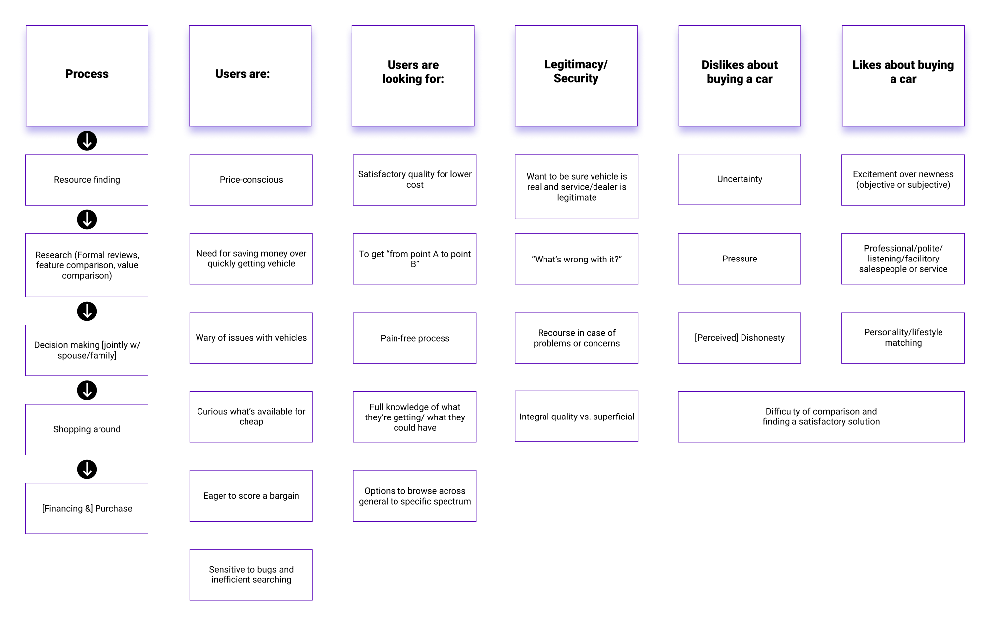
An affinity diagram helped to form basic categories of user insights, as well as to define the general process that users go through when purchasing a vehicle.
Environmental Context Diagram
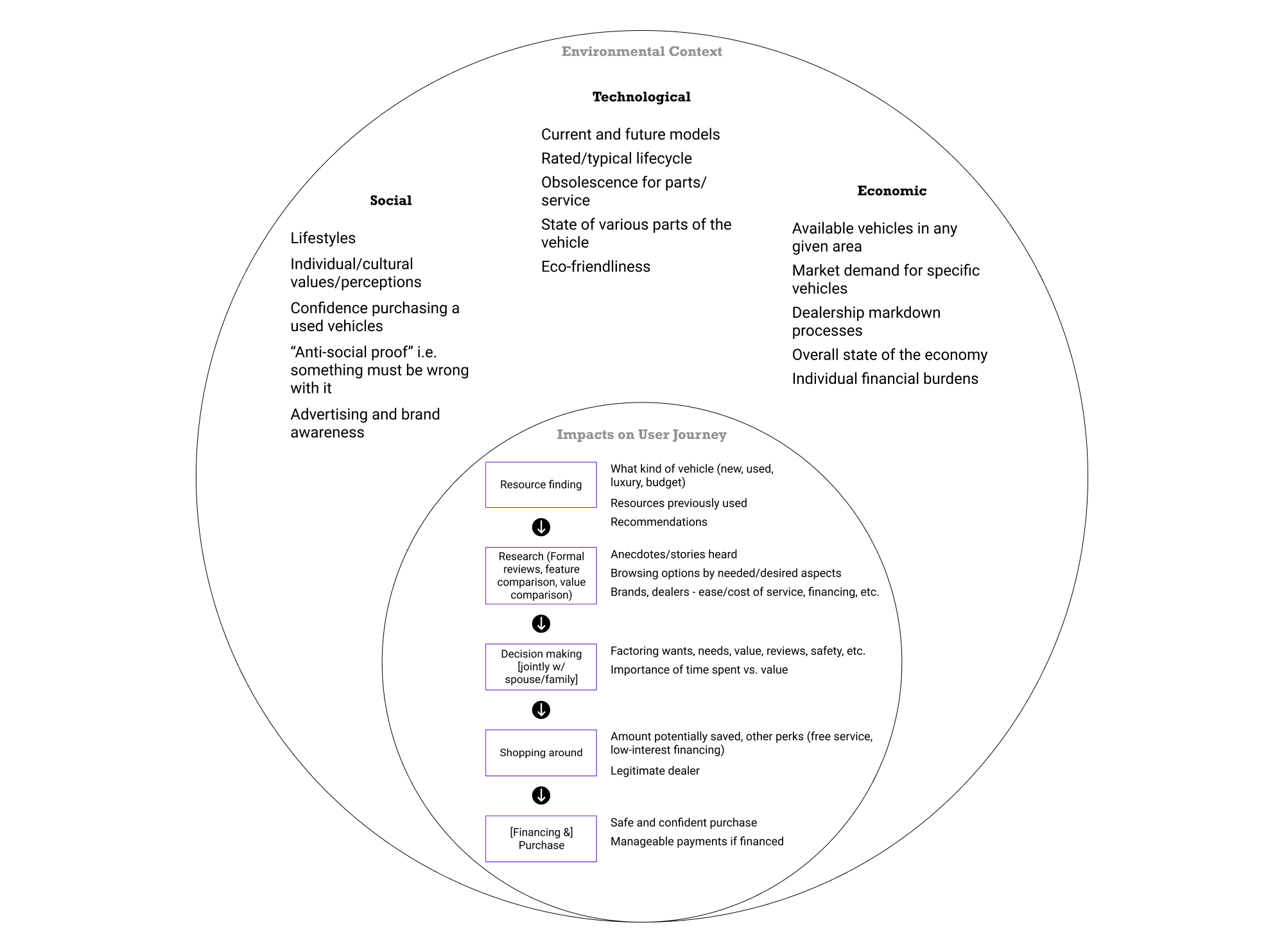
Borrowing from the management classes of my undergrad, I utilized a modified PEST analysis (EST, as political factors weren’t as relevant) in order to place some of these affinities along the expected general process, while maintaining cognizance of environmental factors that may influence user decisions.
Value Proposition Canvas
Based on all of these factors, as well as specified pain points from reviews, I mapped out a value proposition canvas to place this application in the current market.
Resulting Design Decisions
From analyzing these information layouts, I synthesized several key user insights, which became early design decisions. I began by structuring these findings as several Jobs To Be Done (JTBD’s).
- When I’m in need of a new used vehicle, I want to find cheap but reliable cars that more-or-less match my desires specifications, so I can get from point A to point B.
- When I’m considering which vehicle to buy, I want to browse different local options, so that I can later test drive and purchase the best one for me.
- When I’m comparing used vehicles, I want to be able to verify that descriptions are accurate, the seller(s) is/are trustworthy, and prices are fair, so that I can feel safe purchasing a used vehicle that no one else has bought for a possible reason I’m not aware of.
- When I’m comparing used vehicles, I want to learn about the make and model, so that I can make an informed decision about this particular vehicle with services, potential issues, or other general information in mind.
- When I’m ready to purchase a vehicle, I want to be sure that the seller is legitimate and that I’m protected against potential undisclosed issue with the vehicle, so I can be confident in my decision.
Resulting design decisions, meant to facilitate these jobs, were:
- Primary focus entirely on make/model/body type/max price, utilizing a live filter pattern to encourage general-to-specific searches.
- Facilitate:
- A local, intrinsically lower-scale, deal-centric user journey.
- Buyers who might not be as choosy, as the whole concept of the application more lends itself to a “bargain bin”. Users will likely be looking to see what’s there, not for something overtly specific.
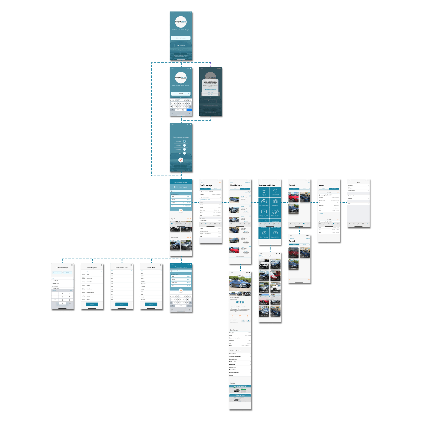
- 4 main sections -- “Home” (links to Search, Browse), “Search” (subheadings Search/Results), “Browse By. . .”, “Saved” (subheadings Listings/Searches), ”More”.
- “New listings” on home as side-scrolling cards.
- Some kind of verification either on listing or during contact with dealer.
- Integrated research articles/reviews into listing pages.
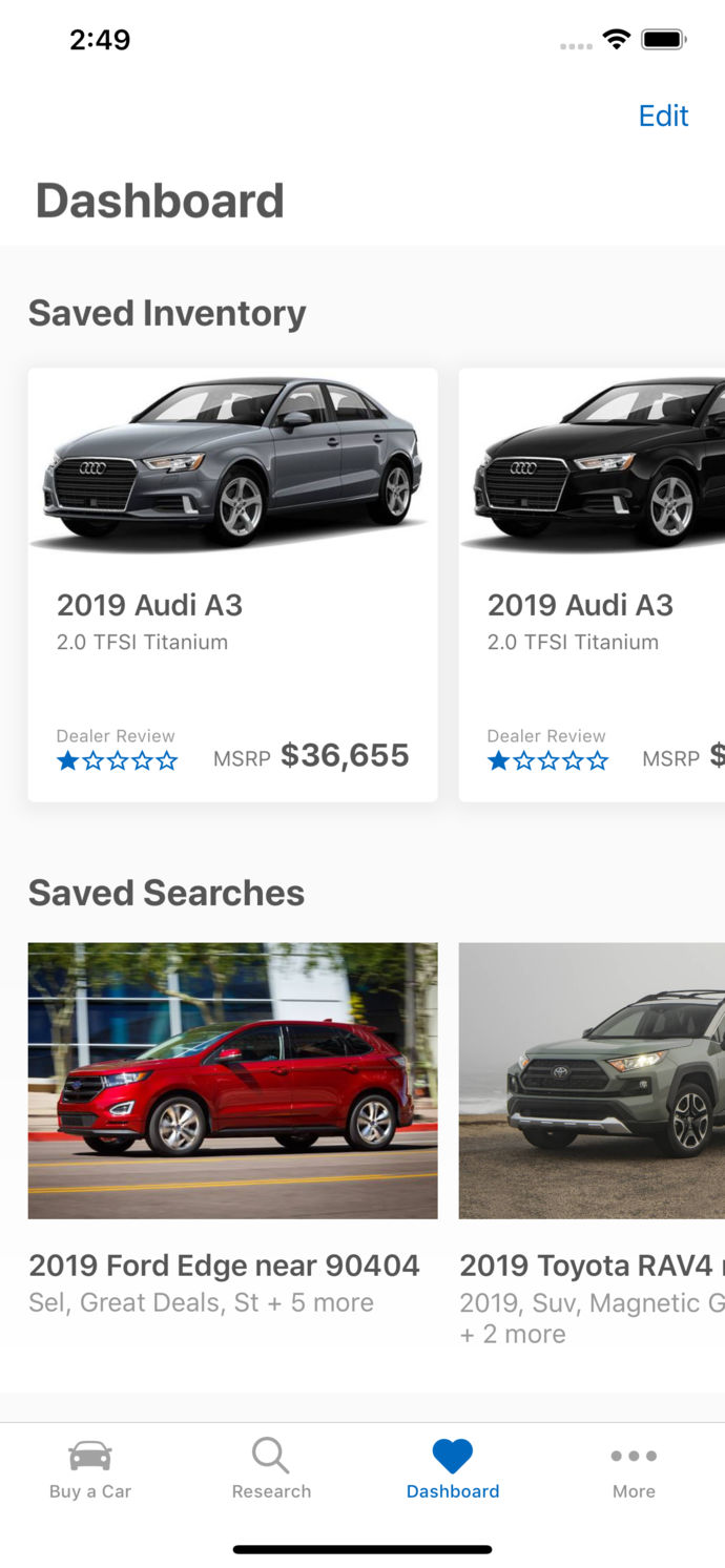
- Emphasized “Save” button, but without requiring an account or sign-in.
- Immediate feedback on no-results searches. Active option filtering based on selected.
- Variable browse categories, i.e. “Newly listed”, “Popular”, “Body Type”, “Make”.
- All search items should be multiple-selectable because it’s less likely that a specific make/model is available.
- Option to add more search terms (additive not deductive).
- Prominent dealer reviews instead of vehicle safety ratings because dealer legitimacy is more pertinent to individual vehicle quality. Option to include formal safety reviewers in bottom review section.
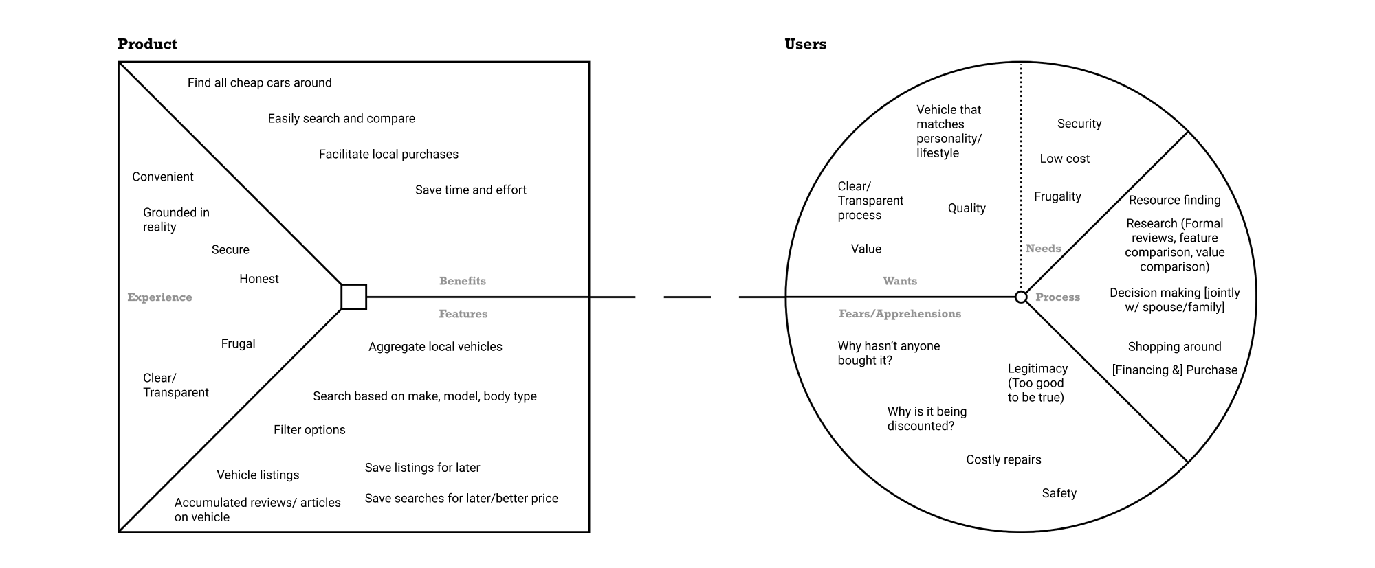
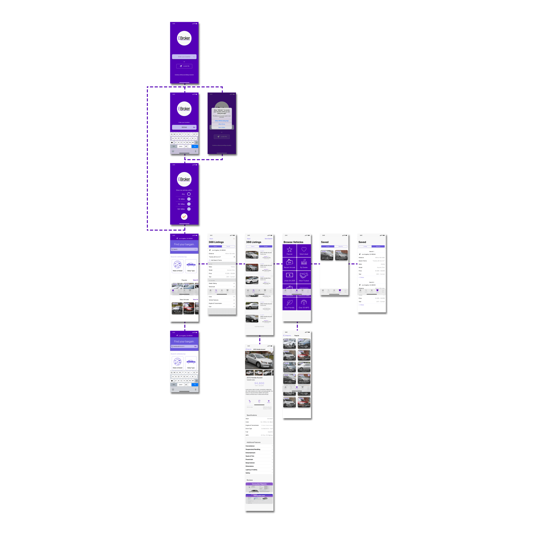
Wireframe


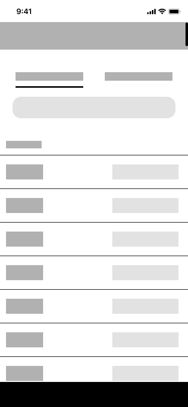
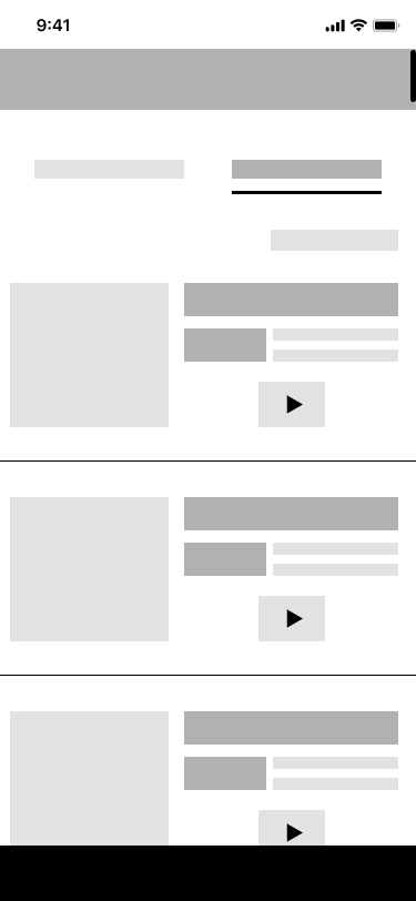


A wireframe was constructed based on the research and resulting design decisions, which included a multi-part search and browsing section.
High-Fidelity 1st Draft
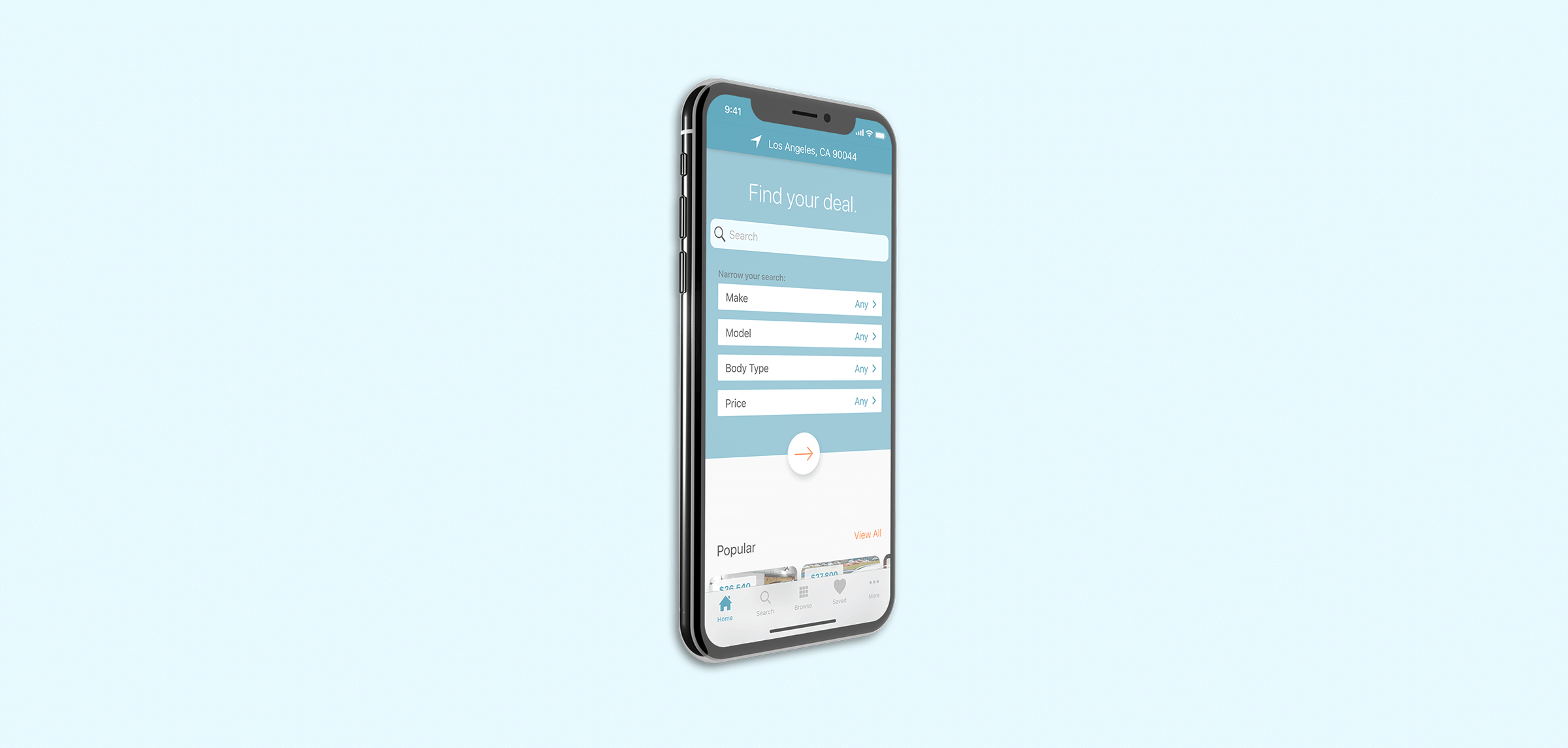
After initial feedback from the client, a first draft of the high-fidelity prototype was designed, then under the name “EBroker”. The visual design was very roughly based on the Edmunds application, with the primary blue being in line with most popular car applications on the market, and the secondary “action button” orange meant to facilitate attention capture for the most important actions throughout the application.
Expected Usage & Cognitive Analysis
Lacking time or a budget to conduct original research on the first draft of this interface, I made use of several techniques to ensure high-quality interaction design. A preliminary heuristic evaluation pointed several potential issues out to me, including issues with the self-evidence of microinteractions and button styles, as well as several layout and hierarchy issues.
I then utilized an interaction design modeling tool I had recently come across, Cogulator (based on a combination of cognitive architectures including GOMS and KLM), in order to model three extended sample tasks based on different usage patterns, representing three different types of users of the application. This was intended to ensure tasks were efficient and without too much cognitive load on the user. The simple act of performing a cognitive walkthrough of each step in of itself was also extremely helpful for understanding how different parts of the application would appear to the user in context.
Use Case 1

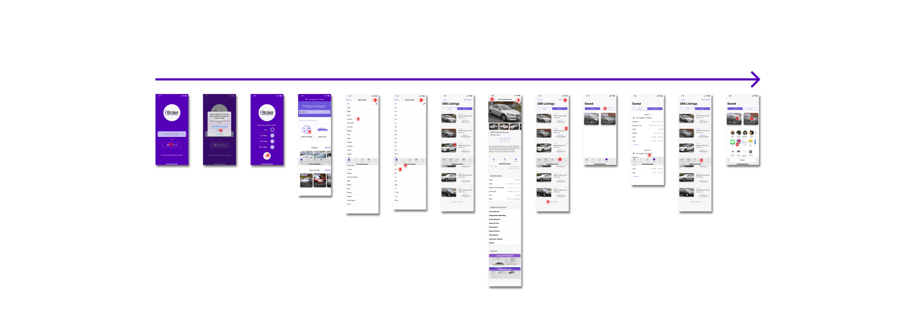
Persona: Actively car-shopping between two or three specific models, semi-price-conscious, regularly uses this application among several. Has moderate knowledge about cars from research.
Usage pattern: Uses app for price-based research on specific models. Checks saved searches regularly for new listings.
Task
- “Locate me”, within any miles
- Searches by Make+Model
- Views 2 sets of listings, views 1 listing, saves 2
- Saves search
- Goes to saved searches, taps on other saved search for same make, a different model
- Views 1 set, views none, saves none
- Views saved listings, emails to self to compare later with listings from other sources
Use Case 2

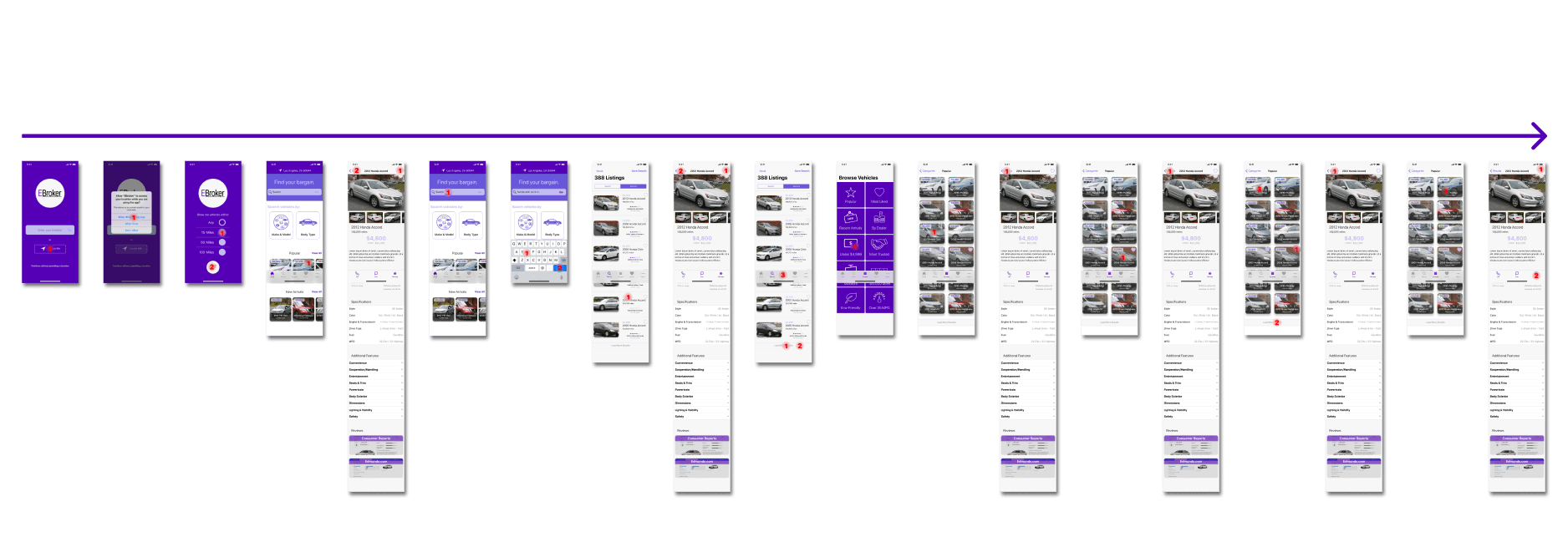
Persona: Has an older car. Casually looking for a new one, but without a large budget and very price-conscious. Very tech-savvy. Low-moderate knowledge of automobiles.
Usage pattern: Performs a new search every 2 weeks for various modifications of cars under $5,000. Occasionally will browse the “Lowest price” browse section, as well as the “Luxury vehicles” section just for fun.
Task
- Selects “Locate me”, within 15 miles
- Browses popular car cards on home
- Clicks listing, reads, likes, goes back
- Searches for that Make-model by keyword
- Views 3 sets of listings, views+saves 1
- Goes to browse section, selects “Under $4,999”
- Browses 2 sets, views 4 listings, saves 2
- After saving last listing, visits dealers website through link, then exits from there
Use Case 3

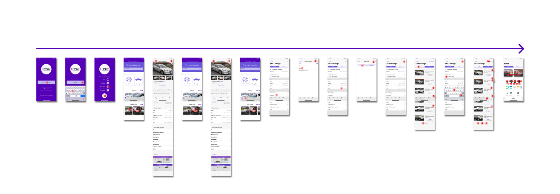
Persona: Used and new auto reseller. Monitors several local vehicle listing applications and websites for options to flip at his lot. Price-conscious in relation to the market price of the vehicle, not as much to a personal budget. More willing to take a chance on used vehicles, due to employing several full-time mechanics for repairs and renovations. Very knowledgeable about automobiles.
Usage pattern: Routinely browses new listings 2-3 times a week. Occasionally will perform a more targeted search if inventory of one type of vehicle is especially low (i.e. pickup truck, hatchback).
Task
- Selects “Enter Location”(Zip), within 50 miles
- Browse new arrival cards, views 2 listings, saves 2
- Clicks search icon on app bar to go to that section
- Filters “Used”, Year >2005
- Views 2 sets of listings, saves 3
- Returns to search tab, adds “hybrid” search term
- Views 4 sets of listings, saves 6
- Saves search
- Navigates to saved, sends saved listings to his partner for evaluation
High-Fidelity 2nd Draft
As a result of the cognitive analysis and another round of feedback, several significant changes were made to the prototype. These included:
- Name change from “EBroker” to “Budget Bucket” (pseudonym).
- The primary accent color being changed to a different shade of blue.
- Addition of an image to the location request screens.
- Single-page form fields with bottom sheet selection for search options as opposed to secondary screens.
- Adjustment of listing cards for better color contrast and legibility.
- Sort options on search results list.
- Rethinking of individual listing page buttons.
- More comprehensive saved listing/search options.
- Addition of a preliminary “More” overflow menu.
- Various other layout, typography, and content adjustments.
Principle Prototype
A version of the prototype with higher-fidelity animations was then created in Principle, primarily for a smoother demo video and better mobile device compatibility for in-person demonstration.
Conclusions
Overall, the resulting prototypes provided several options for the client to demonstrate the application concept to potential investors, business partners, or employees, either in-person or remotely. My intention was to allow the client to demonstrate the highest fidelity of the concept possible, in each type of context.
A personal takeaway was the development of my design “toolbelt”, and experience providing different types of deliverables for different purposes. While with the current state of design tools fidelity versus portability is still very much a tradeoff, I’m confident the combination I ended up using for this project provided what the client expected and more.