Optimizing Official Artist Merchandise Search
Problem
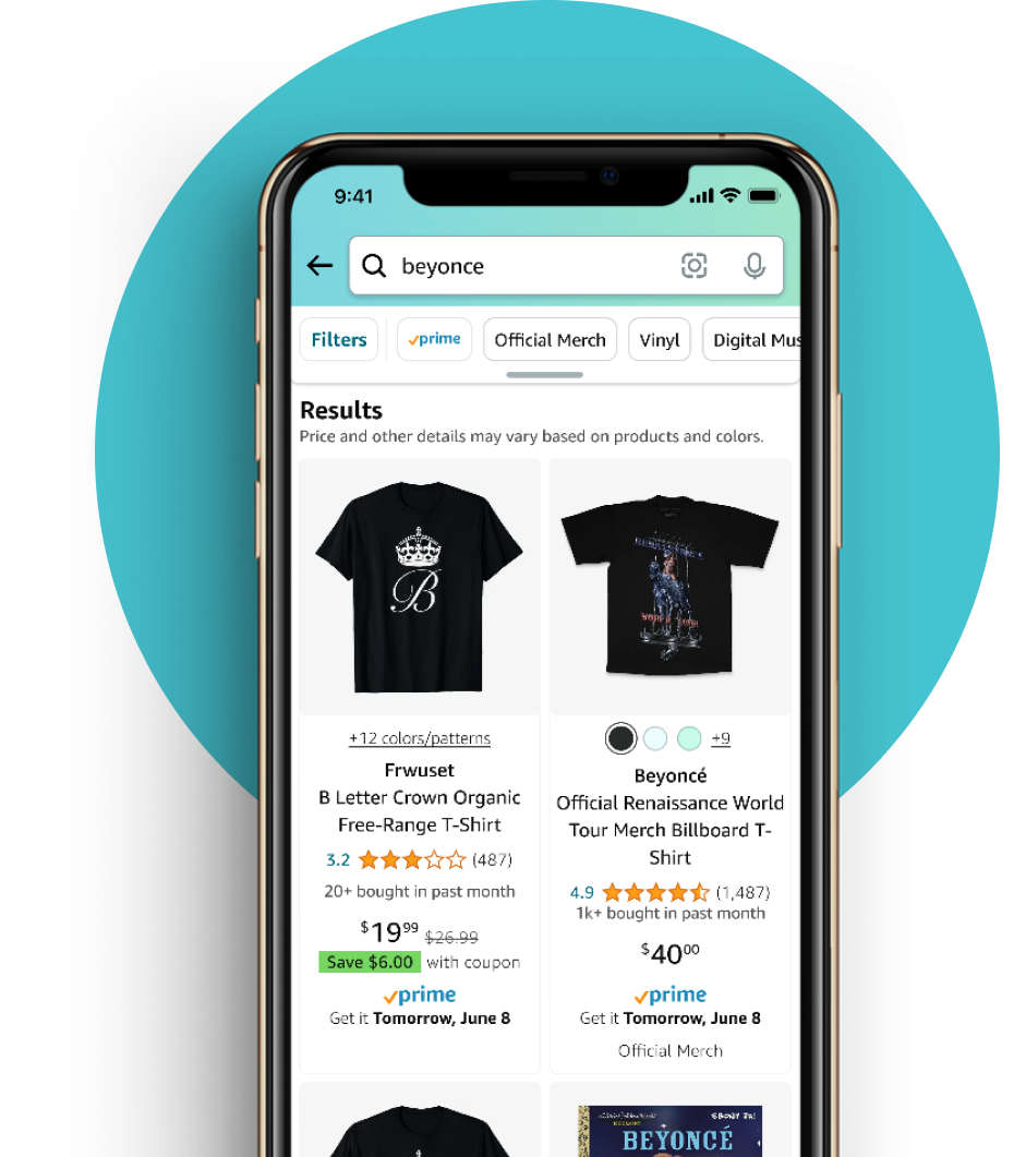
Customers looking for music merch on the Amazon website and mobile app had expressed concern about prevalence of unofficial products. Artists had expressed concern about the effect on their fans and their sales.
~87% of top artist search queries produced irrelevant or randomly organized search results.
Result
UI and search science improvements to minimize customer confusion. In our validation test, the preferred treatment resulted in a 15% reduction in task time and 48% improved click accuracy on official merch.
Industry
E-commerce
Duration
July 2023 - Jan 2024
Product
UI changes to the Amazon retail website and mobile app
My Roles
User research
UX design
UI & Interaction design
Documentation
(10+ person team)
Discovery research
Explorative research included a mix of primary/secondary, and qualitative/quantitative methods:
- Prior research review
Review of relevant previous research, including survey responses and usability testing. - Design context review (Amazon retail conventions)
In-depth review of the Amazon retail design system components, requirements, conventions, and processes. - Explorative usability test with 5 users
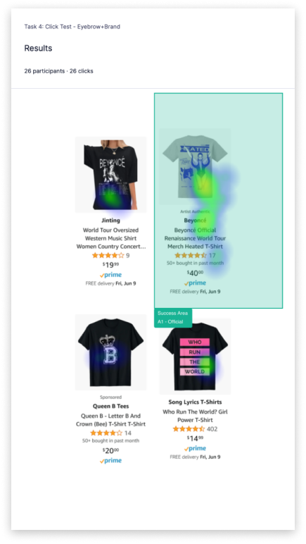
Simple usability test asking users to find official artist merch and artist shops in the Amazon mobile app, and to talk through their search process. - Randomized 1st-click test with 26 users
5 potential treatments were places along “knockoff” products, then customer accuracy, speed, and self-rated ease were assessed.
Key Insights
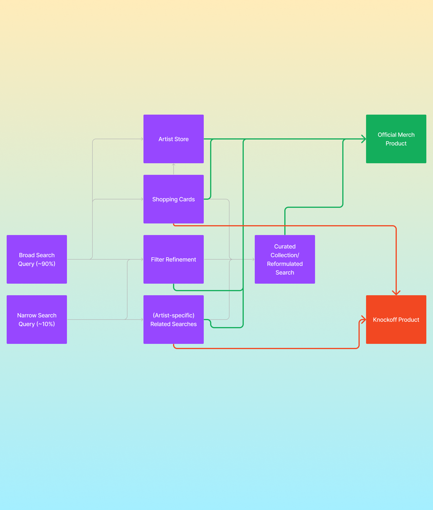
Testers did in fact have some difficulty with finding official merch search results. They’re more likely to perform broad searches (80%), specific searches of “official” actually turned up worse results, and the issue was compounded when testers weren’t familiar with the artist.
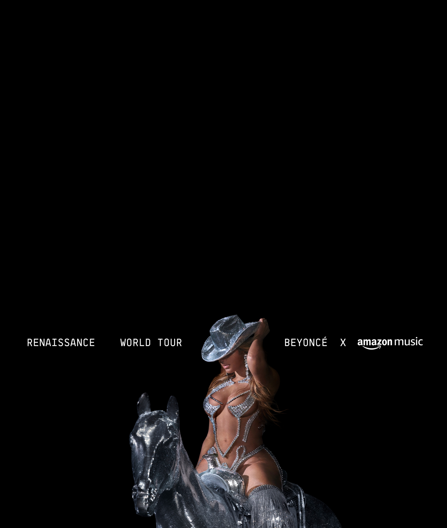
Testers couldn’t find the official store, even when presented with a sponsored banner ad. Banners weren’t actually displayed particularly often (60%) although testers were looking for mentions of the keyword “official”. 50% of testers who were displayed banner ads clicked through to find official merch.
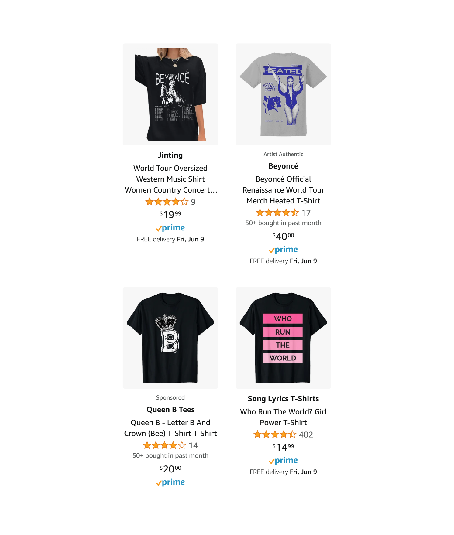
Testers had a clear preferred product card, making use of an "eyebrow"-style title in the style of featured and sponsored products. It had a 19% higher sucess rate (69%) and took 3.5 fewer seconds to locate (10.5s) than the next best option. In addition to their actions, testers verbally expressed that this option was more clear and better communicated "official" than every other option.
Explorations
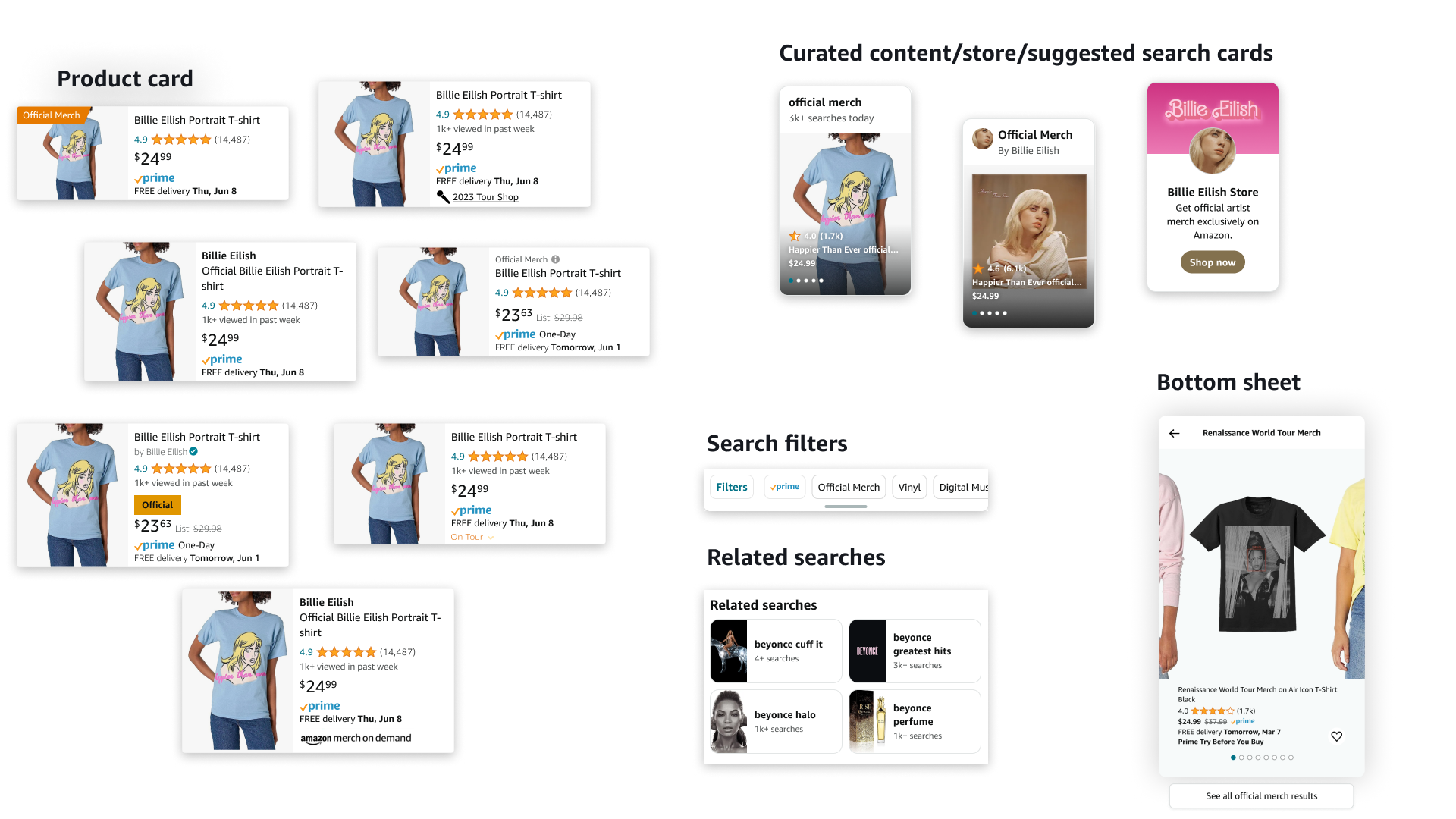
During and following research, I generated a large number of ideas to explore the range of possibile solutions with the Amazon Rio and Tapestry design systems.
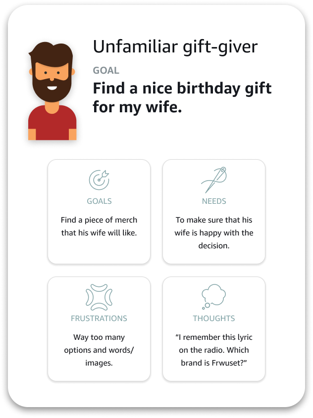
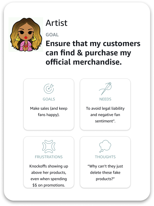
Defining our users
Drawing on prior research and results from explorative usability testing specific to this project, primary users were grouped into:
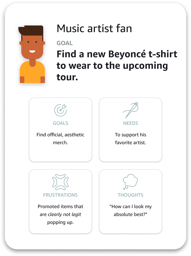
Selected design directions
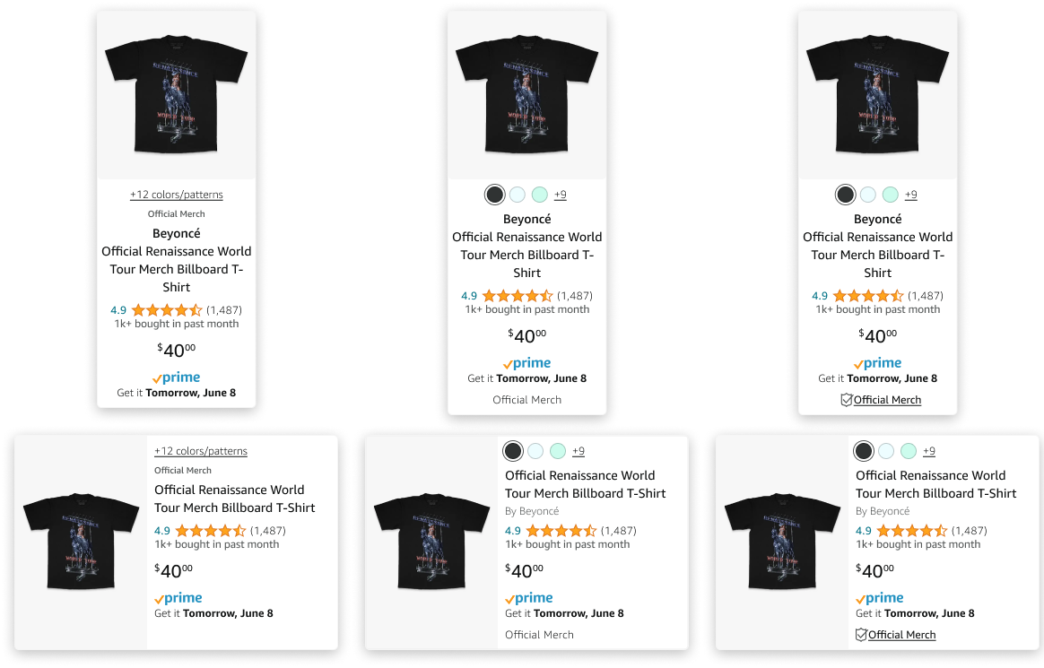
Through collaboration with the Search CX team and product managers from the RMX team, 3 design treatments were selected for further refinement based on several criteria:
- Product card ingredient requirements & guidelines
- Test performance
- Visibility of new element(s)
- Minimalism
- Avoidance of duplicated element cases
Design decision: Consolidating options for composability
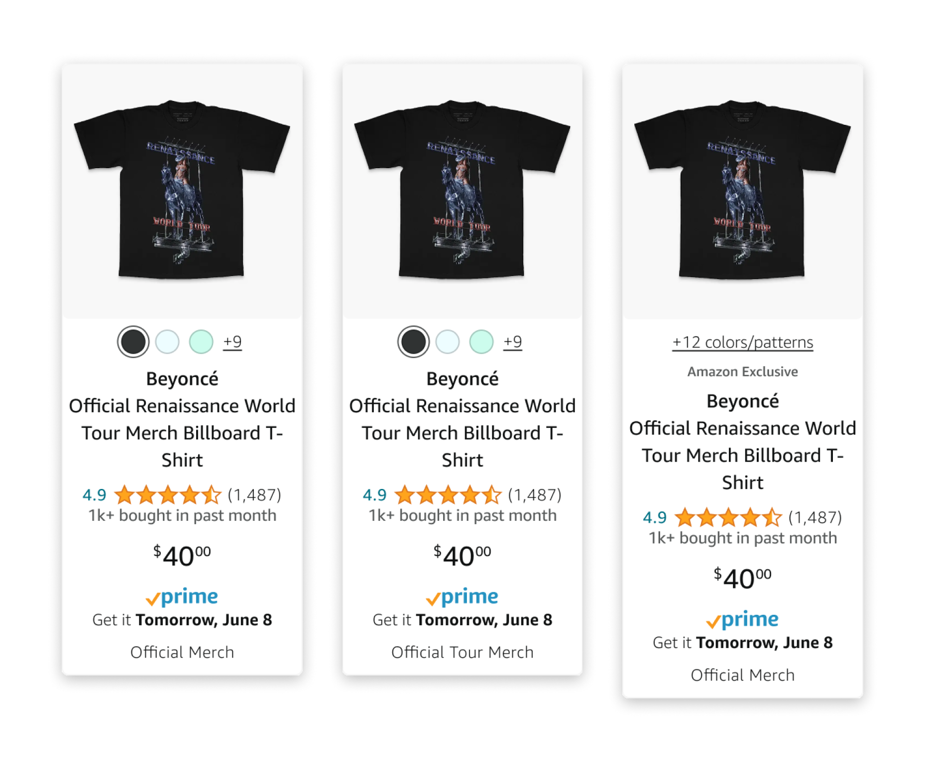
We began further design iteration and ran into several potential sources of conflict when defining how cards should be displayed under the categories of “official”, “tour-related”, and “exclusive”.
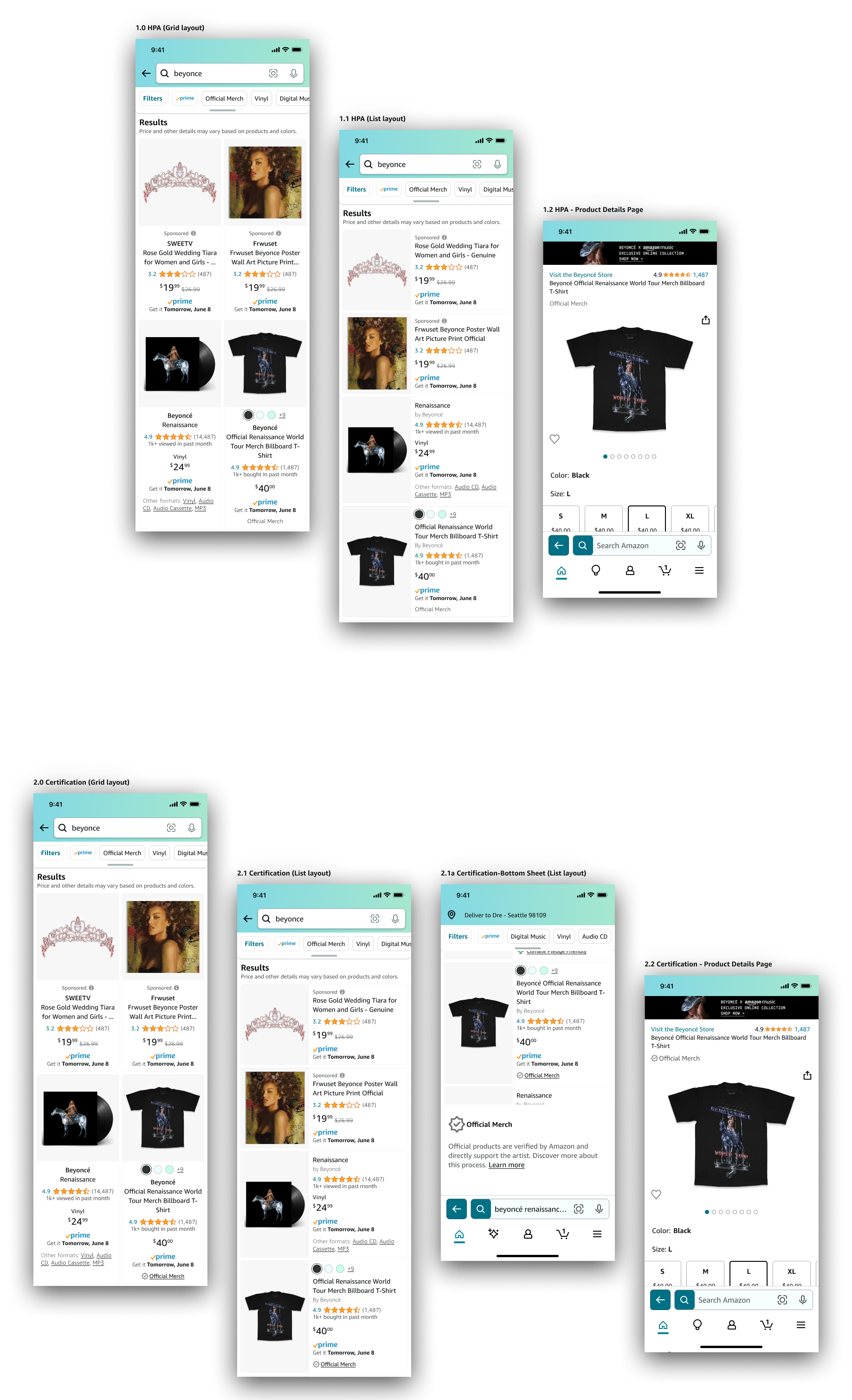
We decided to rethink the eyebrow title (T1) as a modifier only for “exclusive” merch products, as this best aligned with it’s current use for sponsored or featured products. This would allow for changing the T2 or T3 string to designate “official merch” or “official tour merch” and would account for all use cases.
We also had to consider whether it would even be possible to dynamically change this text for a certification element. At this point we opened a thread with our content team to workshop the exact messaging.
Evaluative research
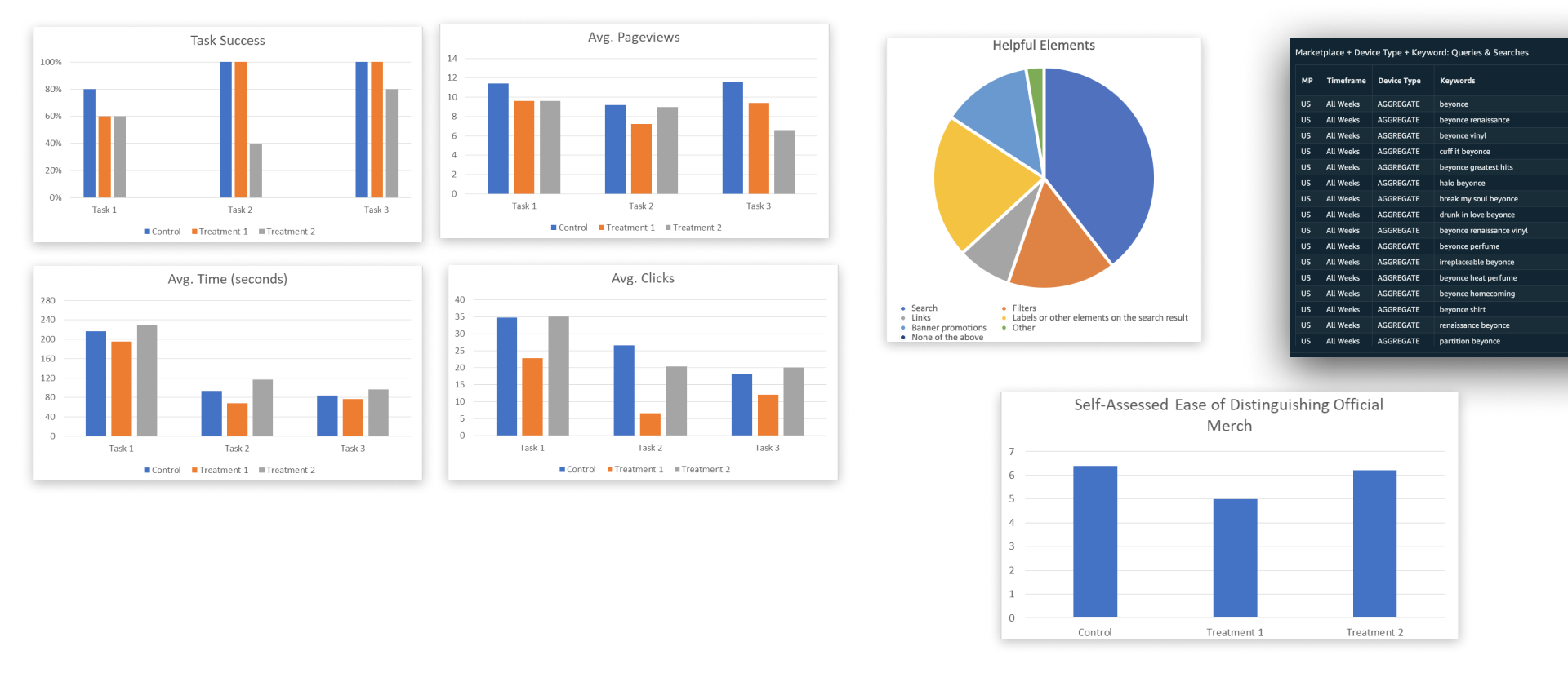
A further testing plan was designed to evaluate a narrowed selection of prototyped treatments (2 & 3, now 1 & 2), intending to examine the treatments in context of other potential solutions to the official merch problem. Results would be used to formalize our choices
The Figma prototype utilized search data to provide accurate search choices and results screens. In addition, banner ads, an “official merch” filter option, as well as related searches were included to evaluate their helpfulness in tasks.
Results
There was an average 15% reduction in task time, 48% reduction in clicks, and 33% reduction in pageviews from the Control to Treatment 1. However, tester comments indicated helpfulness of visual elements in discerning official products. As a result, we decided that results were inconclusive and both treatments should move forward to the live A/B test.
Secondary solutions were found to be helpful by multiple testers, and this led to further ideation on the other solutions in a separate workstream.
“I felt the Official Merch filter was very helpful but it would also be nice if I could sort by product line/tour line.”
Legal considerations & content optimization
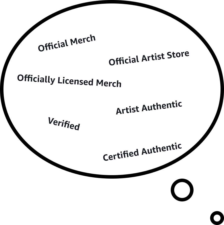
We reached out to our content writing team and their legal contact about the exact messaging of the intended label. Initial concerns were around the use of terms like “official”, “certified” and “verified” as making unintended implications.
After several conversations, we concluded that “official” was safe to use but “certified” or “verified” would only be able to be used after some kind of certification/verification process. This process was delegated to product to explore.
Weblab and launch process (In progress)
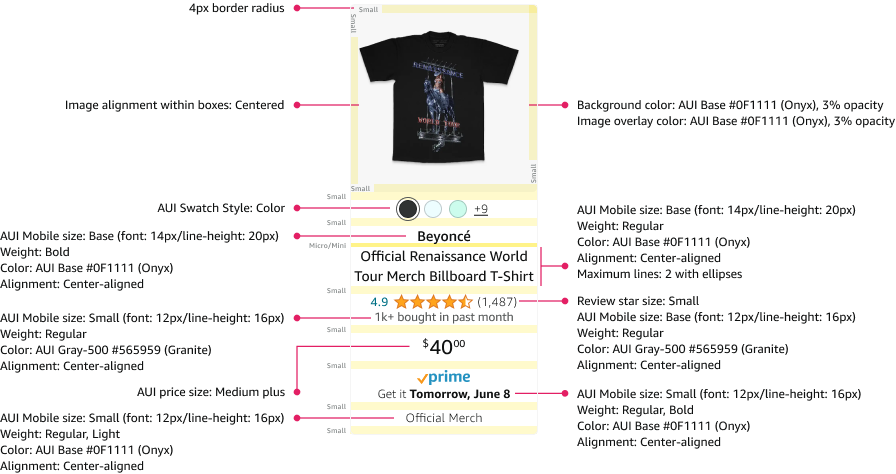
Final designs were checked for alignment to live app components, and conditional layouts were documented.
Next steps are to implement these designs in a weblab (live A/B test) to assess which should move forward in the live app.
Measuring outcomes
Goal: Measurably increase proportion of music merch product sales that are official.
Measure: Achieve probability that a given music merch product sale will be licensed >66%.
Goal: Increase order completions for official merch products found through top artist search queries .
Measure: Increase purchase rate of official merch products +0.25% or greater and add-to-cart rate +0.5% or greater over 4 week period.
Goal: Reduce return rates of music-related merch products, official and not.
Measure: Reduce returns of music-related products -0.5% or greater over 4 week period.
Conclusion

The official merch problem was especially complex, but was nearly resolved within this 6-month timeframe.
Takeaway—
Properly establishing context for an impactful design problem can require solving for many interconnected, sometimes conflicting pieces. Visual artifacts help keep stakeholders aligned.