Flight Planning
Problem
The USAF Air Mobility Command internal data streams weren't sufficient to account for environmental and event-based variables when planning mission routes. Our open-source data capabilities were leveraged to bring relevant information to an operator's attention.
Result
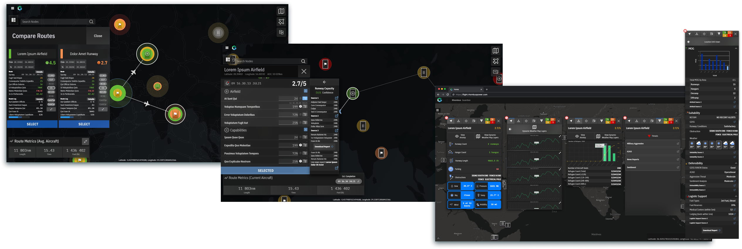
A planning application that aggregates a range of data sources and displays pertinent information to analysts at relevant times. Several examples of this information include airfield capacity, fueling status/sources, refugee counts, & potential threat status.
Industry
Defense & Space
Duration
July 2021 — Dec 2021
Product
Web application
My Roles
UX design
UI & Interaction design
Production
Developer support
(8+ person team)
Objectives
Establish client requirements, user goals, and product specifications.
Iterate several drafts of a design, accommodating changing requirements from various stakeholders.
Accommodate last-minute client requests at development time.


UI Requirements

Conversations began in July 2021 with the client and subject matter experts in order to define initial requirements. Our primary objectives involved leveraging different data sources in order to:
- Identify airfield characteristics that would lend to a favorable or unfavorable stop for various aircraft
- Scope overall routing while detecting inefficiencies
- Alert operators with time-sensitive Indications & Warnings (I&W) to potential adverse conditions and/or threats.
Defining Users & Uses

Our users included 3 main groups:
- Dedicated logistical/mission planner (creating scenarios, running scenarios)
- Commander/General/Leadership (creating scenarios, administrating use)
- Experienced operator under supervision (running scenarios)
Associated user goals and use cases were also defined according to respective job duties and outputs.
Screen Flow
A diagram of UI screens became our main reference for top-level organization, accompanied by UX materials, an element-level IA diagram, and a UI process diagram, created in collaboration with the development team.

Design decisions
The design was created through 2 main sprints over a period of 5 months, with ongoing client feedback shaping the design.
Mission Setup & Organization


Mission setup originally included an organizational layer, start/end point selection, and aircraft selection to reflect the clients offline processes. As additional features were requested elsewhere in the app, we determined that mission setup could be streamlined into several inputs on the initial view for the alpha/MVP version of the UI. The revised flow took only 1 view, and consisted of only 4 essential inputs (for calculating time-sensitive and aircraft-relevant projections).
Information Types — Location

The main point of the UI being to assess airfield suitability, location-centric metrics and the associated location node UI element were a core focus of the design process. Core metrics were divided into operational, logistical, and threat metrics. Over the 5-month process, additions were also made to support location-centric refugee and other data.
Once we had better fidelity on the data points that would be able to bring into the application, we made the decision to simplify the location node, so as to not mistakenly imply uncertain statuses.
The location node was expanded in the 2nd sprint to include additional information, including a revised set of status indicators based on more accurate judgement calls we could quantify, more accurate weather and airfield capacity data, as well as a news feed for local indications and warnings.
Information Types — Travel

Considerations brought by the client to travel between two points included fuel, weather, and airspace. We included relevant information on a route-specific UI that appeared when creating a new routing step, as well as alerts for potential or concrete issues with taking a specific route. These designs factored into an AI-based alternative route feature later on.
Information Types — Mission

Mission information included information relevant to all legs and routes relevant to a specific course. While the specifics of mission tasks weren't known initially, we agreed that it would be a potentially useful mechanism for making notes of considerations to be made that couldn’t be quantified as easily.
Airfield View

A view was designed and developed during the 2nd sprint to provide ground-level information about capacity, conditions, and potential hazards for a given airfield. We utilized Shapefiles overlayed on fixed MapBox views in order to visually display runway and taxiway conditions, as well as hangar capacity/status.
Mission Summary

The mission summary screen provides overall metrics for a given mission, and was made easily accessible from the home screen for reference and analysis.
Routing Patterns
Smart progressive information display was critical to facilitating our users’ goals. We referenced requirements to rank data points into 1st and 2nd priority, and surfaced relevant status indicators and alerts at appropriate decision points.

Integrating AI-supported Decision Making
AI-assistant recommendations were a later addition to the product. Client analysts were consulted to ensure that recommendations were helpful. An overview modal was added to provide better top-down assessment of the route, with our AI avatar providing potential improvements.

Development Sprints
Development took place over 2 separate sprints. The first produced the MVP dashboard, with the second focusing on P1 features, while iterating on current UI and data.
While the short overall development timeframe with many people involved was a challenge, we created annotated component boards to centrally share specifications.

Component Development
Post-project, standalone components were developed with foundation of the IBM Carbon Design system. These components were made 1-1 with design components through a collaborative process to increase efficiency of future changes to the UI as well as other projects.

Conclusion

Our flight dashboard was well-received, despite several design tradeoffs being made in exchange for greater focus on functionality requirements. Challenges of this project included the definition and application of complex subject matter/data, as well as accommodation of extremely short and constrained development cycles.
We confirmed that goals of maximizing aircraft capacity utilization and general aircraft safety were met, and the project could begin to provide real value for the analyst office once deployed to their secure network.